
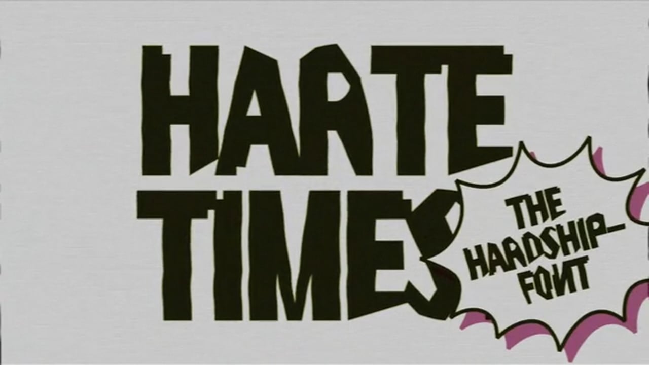
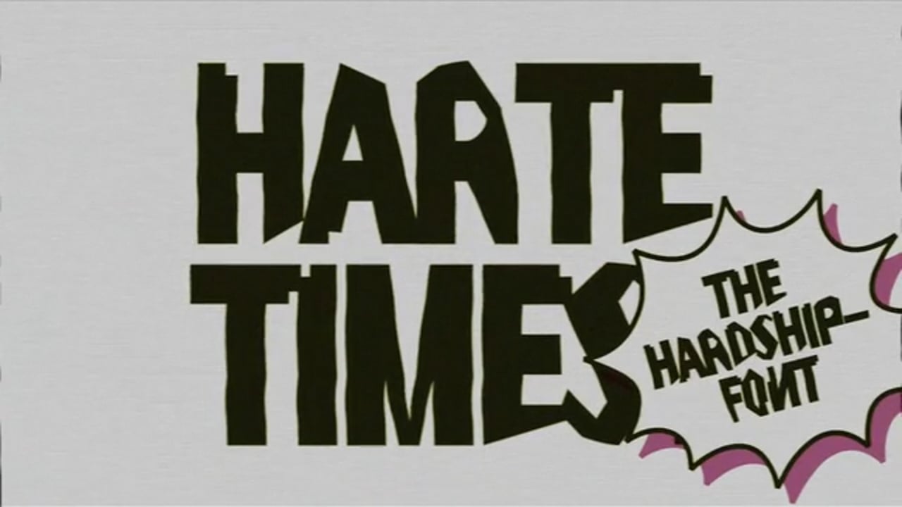
A satire art project that uses typography to draw attention to the ills of business and bring like-minded people to my freelancer website: Die Harte Times – Die Härtefall Font. The Austrian government’s treatment of its citizens and the art scene in times of the Corona Pandemic visually embodied in a font. The result: The target group felt understood. A call to revolt, something to laugh about, and attention at the same time. A protest that manifests itself in a font.
Harte Times – Die Härtefall Font
Awards
Member Club Gold Award
Design
Any Other
Details
Categories:
Country:
Year:
Credits
Client:
Agency:
Art Director:
Toni Eisner
Copywriter:
Toni Eisner
Creative Director:
Toni Eisner
More Any Other Works
-
Shortlist Design Any Other
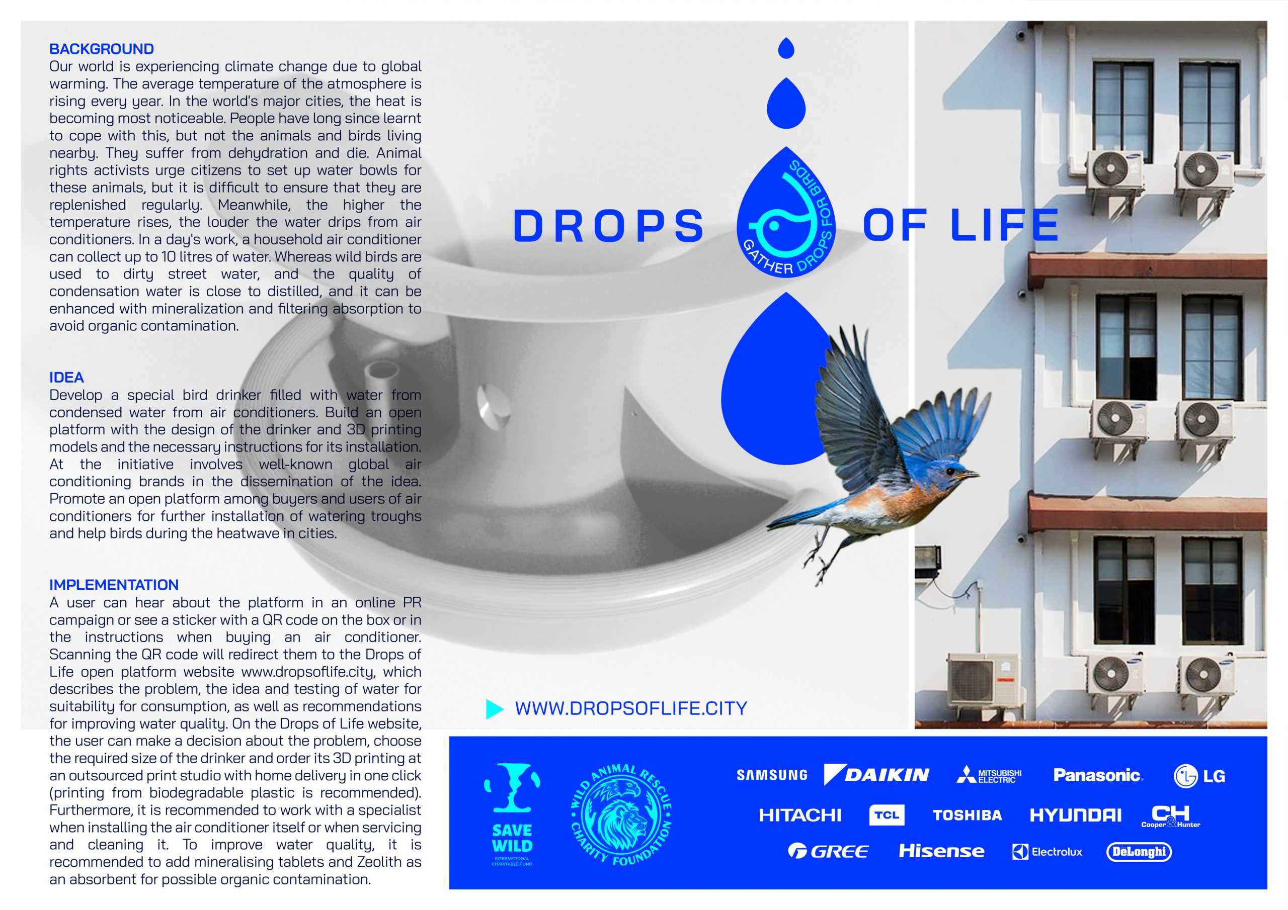
Drops Of Life
Leo Ukraine / Kyiv
-
Bronze Award Design Any OtherShortlist Interactive & Mobile Interactive DesignShortlist Interactive & Mobile Data Visualisation
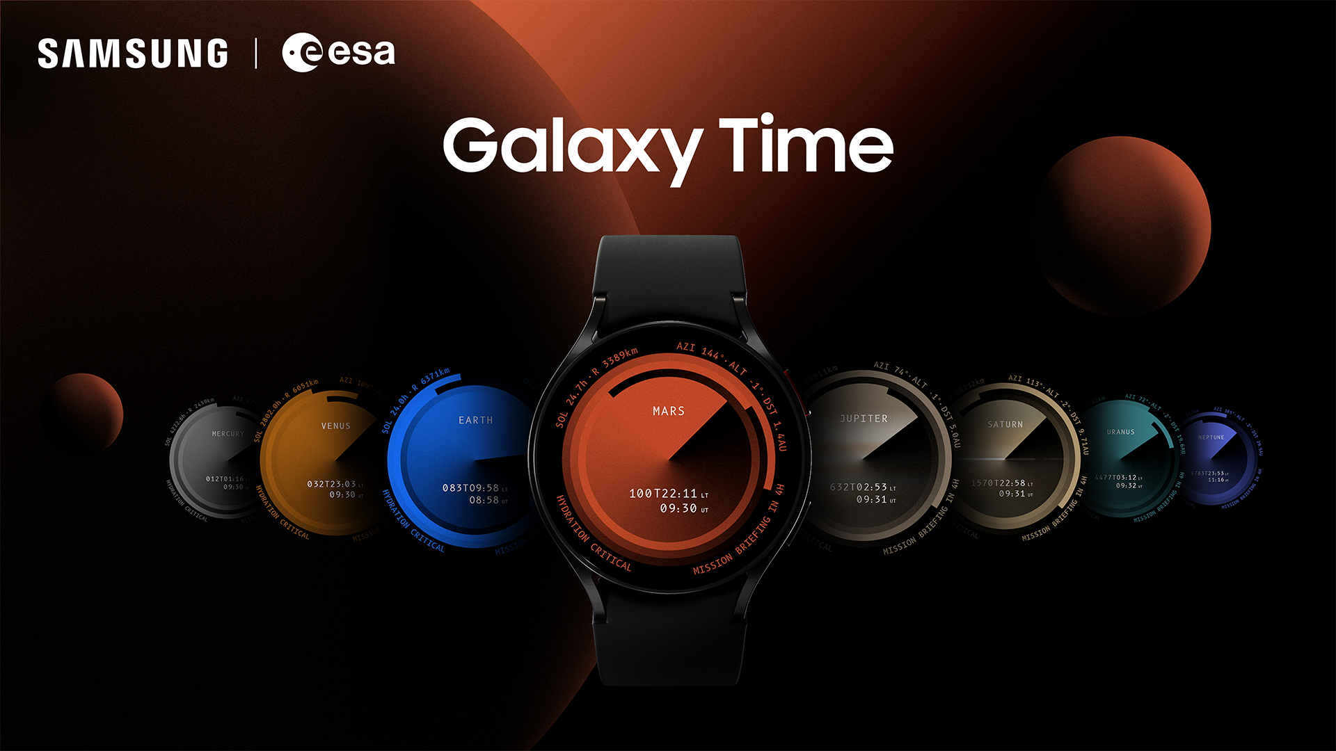
Galaxy Time
Leo Germany / Frankfurt am MainMetaDesign
-
Gold Award Brand Experience New Use of MediaSilver Award Design Any OtherShortlist Interactive & Mobile Digital Service Experience

CAMDOM. The first digital condom
INNOCEAN / Berlin