
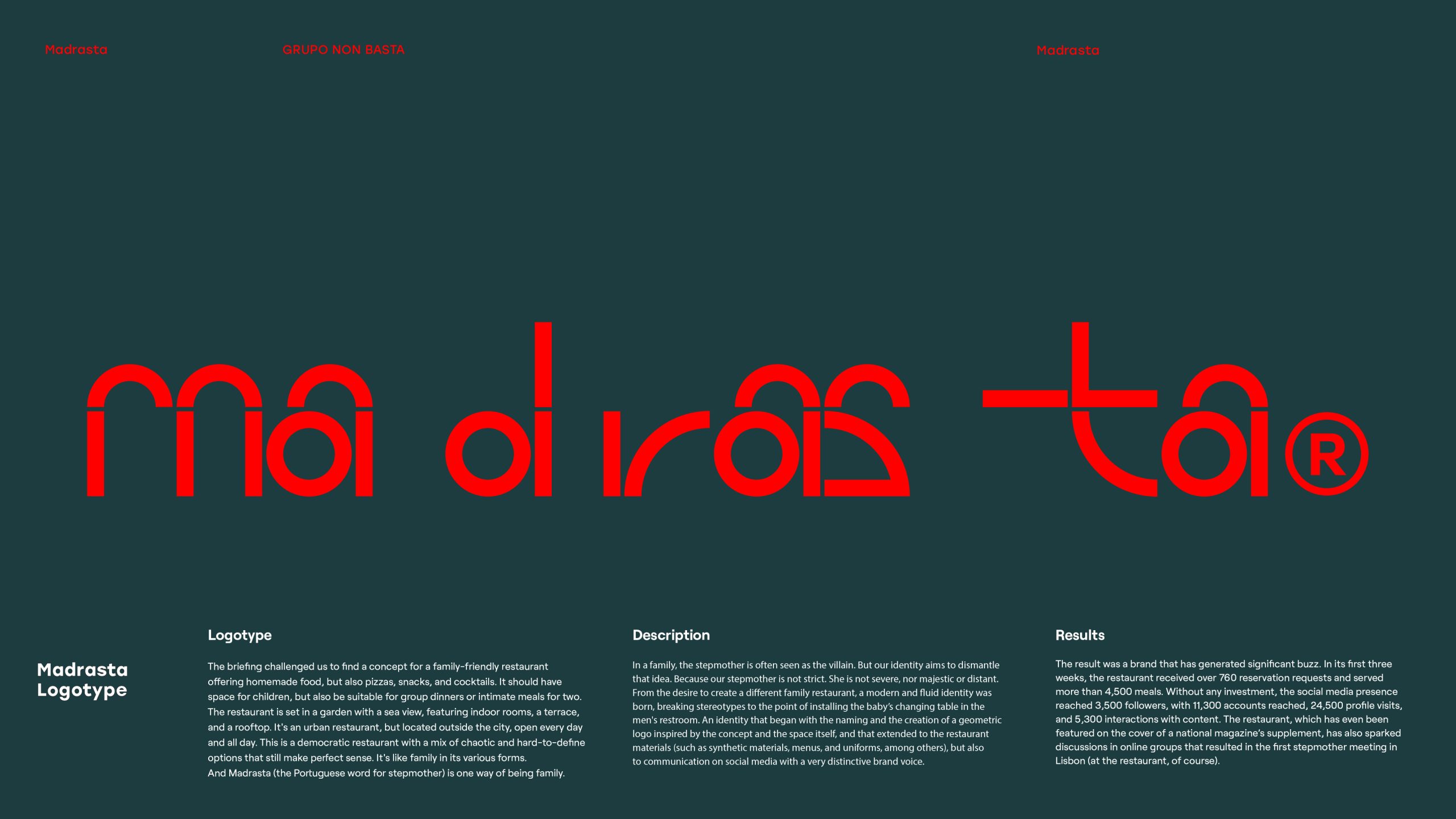
This is an identity for a familiar restaurant with a mix of chaotic options that make sense: much like family, in its various forms. Madrasta (“stepmother” in Portugese, a tabu-word) was the naming and starting point of a graphic identity that deconstructs stereotypes. Inspired by the restaurant’s name and space—by the orange and green colors, and its checkered wall—we created a geometric logo that is fluid, progressive, and approachable.
Madrasta
Awards
Bronze Award
Design
Logotype
Shortlist
Design
Corporate Brand Identity
Details
Categories:
Country:
Year:
Credits
Client:
Madrasta
Agency:
Designer:
Armando Gomes


More Corporate Brand Identity Works
-
Shortlist Design Logotype
20 Years of Casa da Música
Bastarda / Porto
-
Shortlist Design Corporate Brand IdentityShortlist Design Packaging
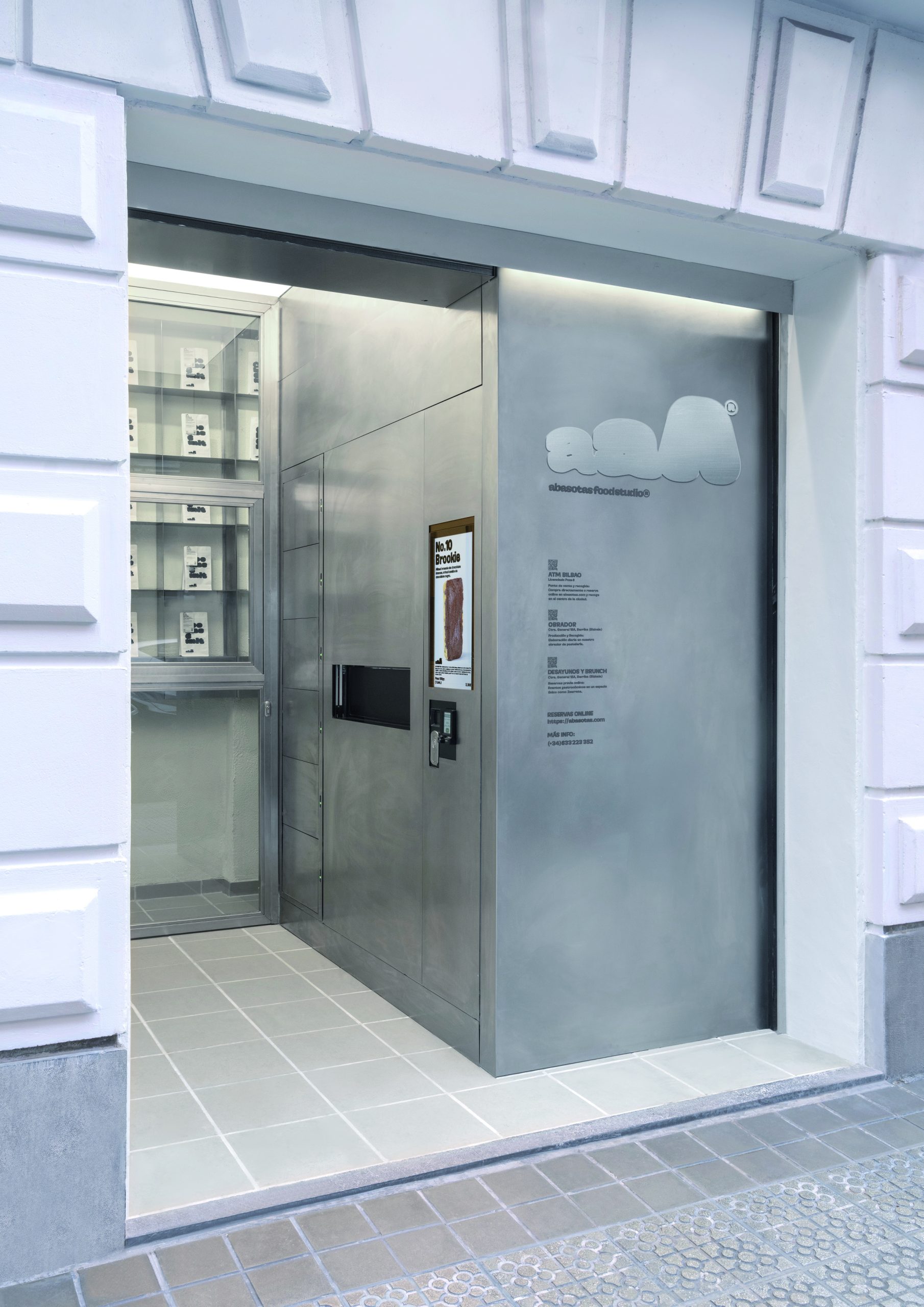
ABASOTAS FOOD STUDIO
PENSANDO EN BLANCO / HondarribiaABASOTAS FOOD STUDIO / BARRIKA
-
Shortlist Design Corporate Brand Identity

Johnny Pep Microfarm
Kleanthis Loizou / NicosiaStelios Demetriou / Nicosia