
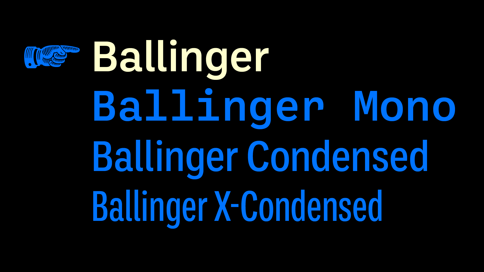
Ballinger is a plain, hardworking grotesque: a simple tool for clear communication, with large counters and a generous x-height. Letters like a, e, and s open out gradually as they move from Thin to Black to maintain ample apertures, even in the darkest weights. It’s available in eight weights and three widths, plus an eight-weight monospaced companion. Italics incorporate subtle ogee curves to lend warmth and energy to the page or screen.
Ballinger Typeface
Awards
Member Club Gold Award
Graphic Design
Any Other
Details
Categories:
Country:
Year:
Credits
Client:
Agency:
Creative Director:
Max Phillips
Designer:
Max Phillips


More Any Other Works
-
Member Club Gold Award Graphic Design Any Other
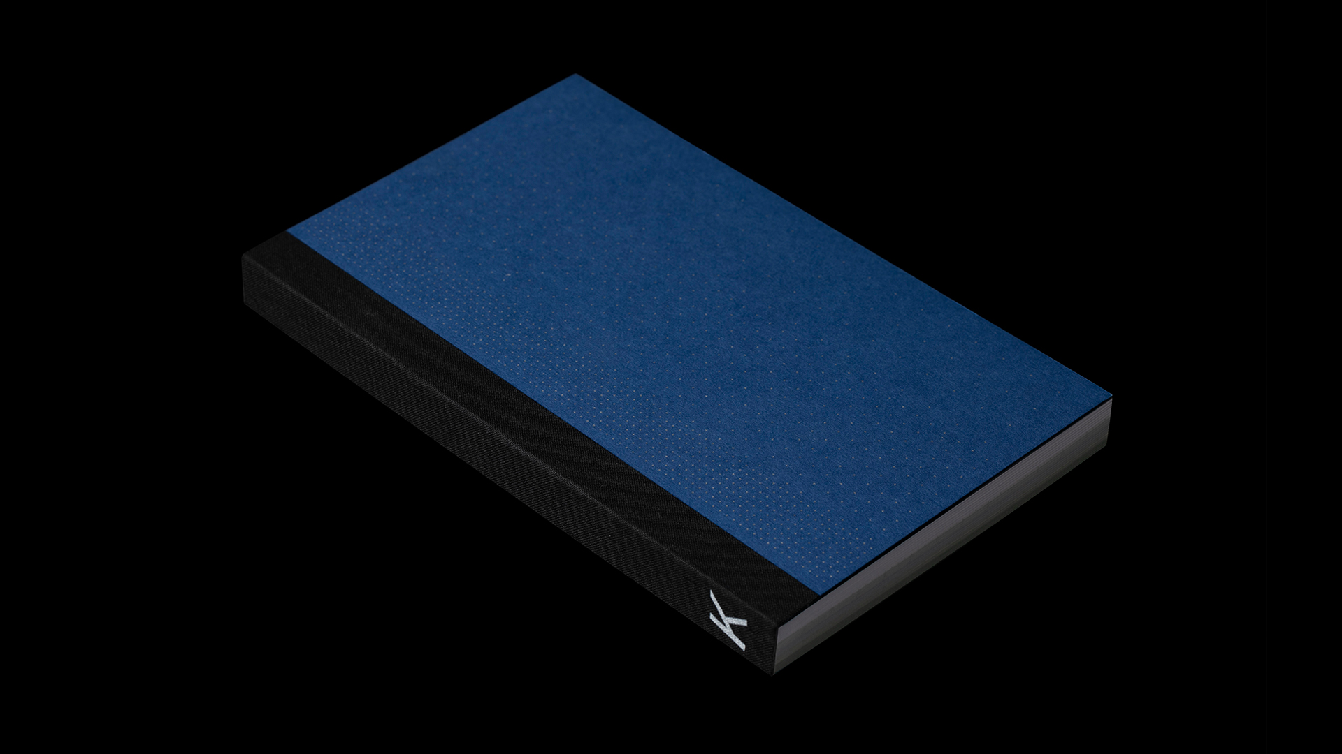
Klimamichaniki
Semiotik Design Agency
-
Member Club Gold Award Graphic Design Any Other
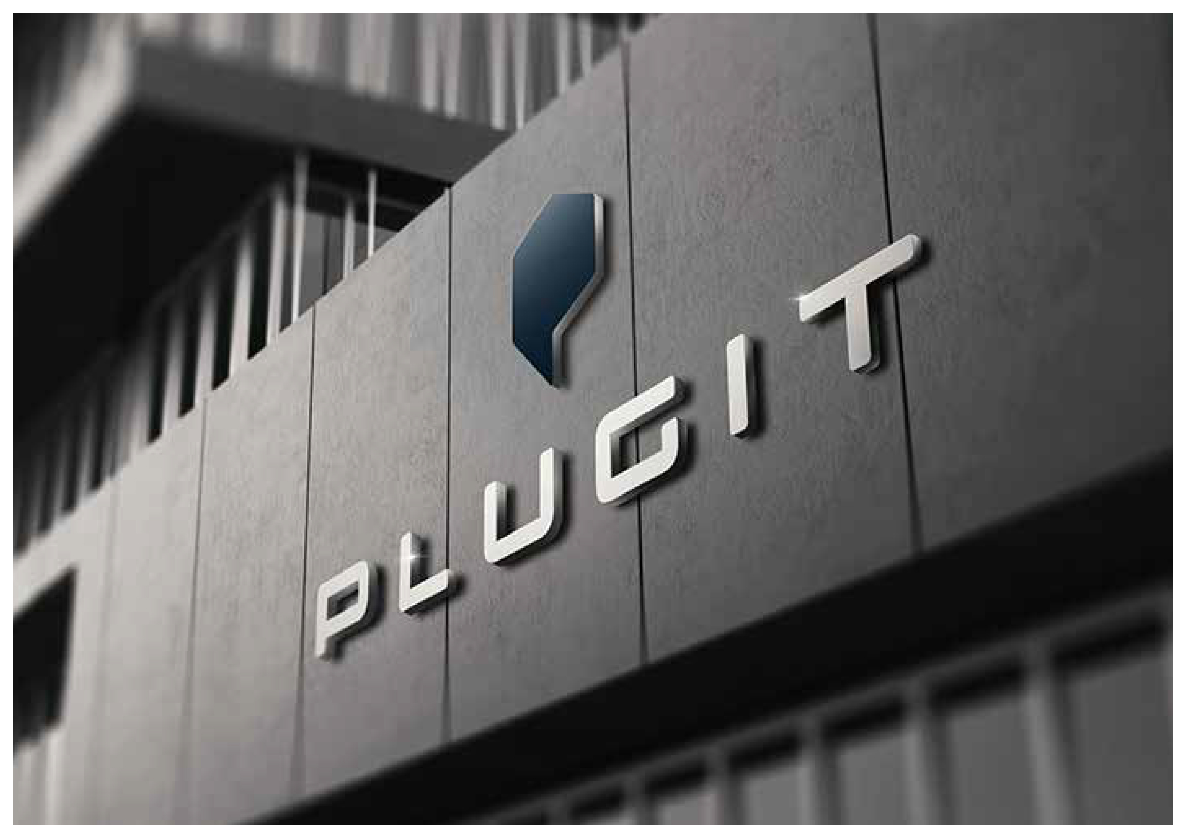
Plugit Logo ID
ReD. Brand Design
-
Member Club Gold Award Graphic Design Any Other
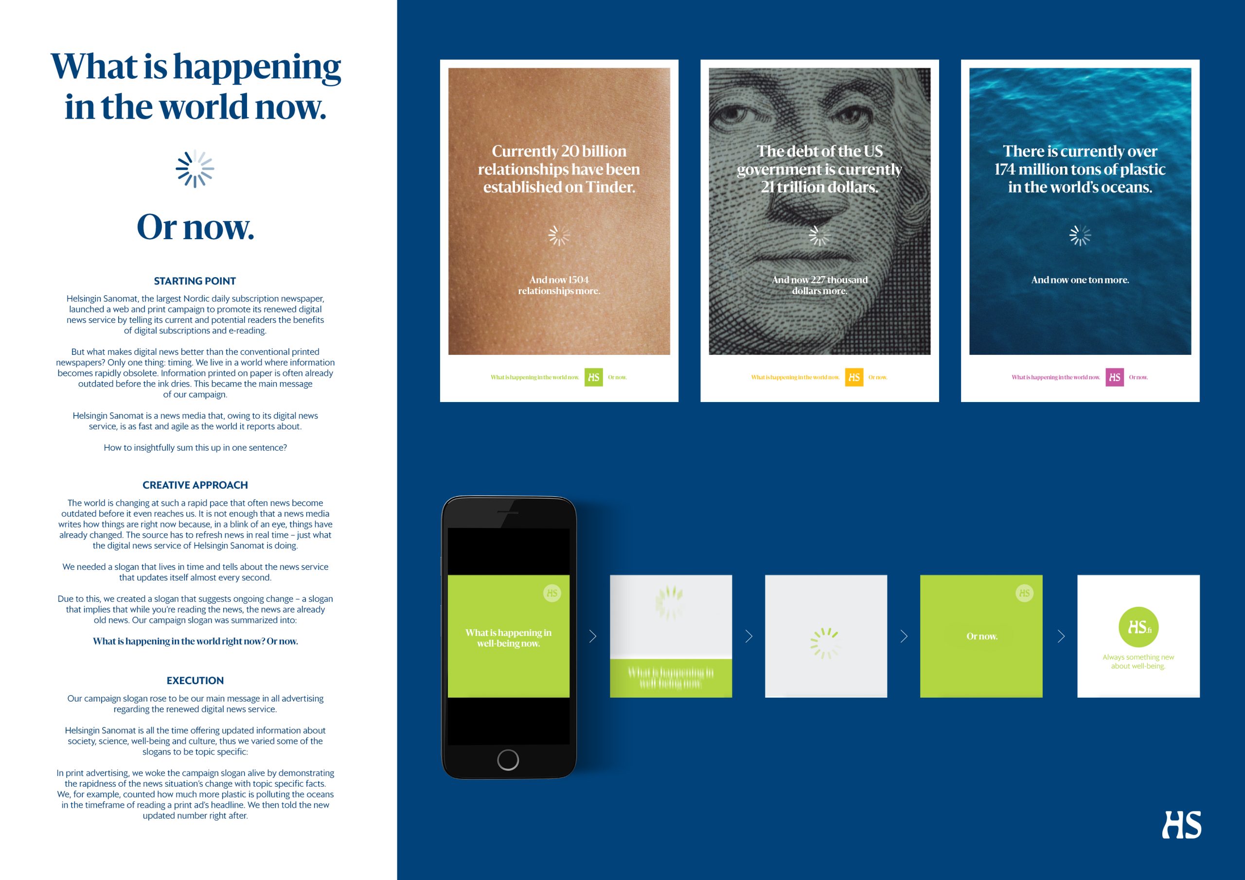
What is happening in the world right now? Or now.
TBWA\Helsinki