
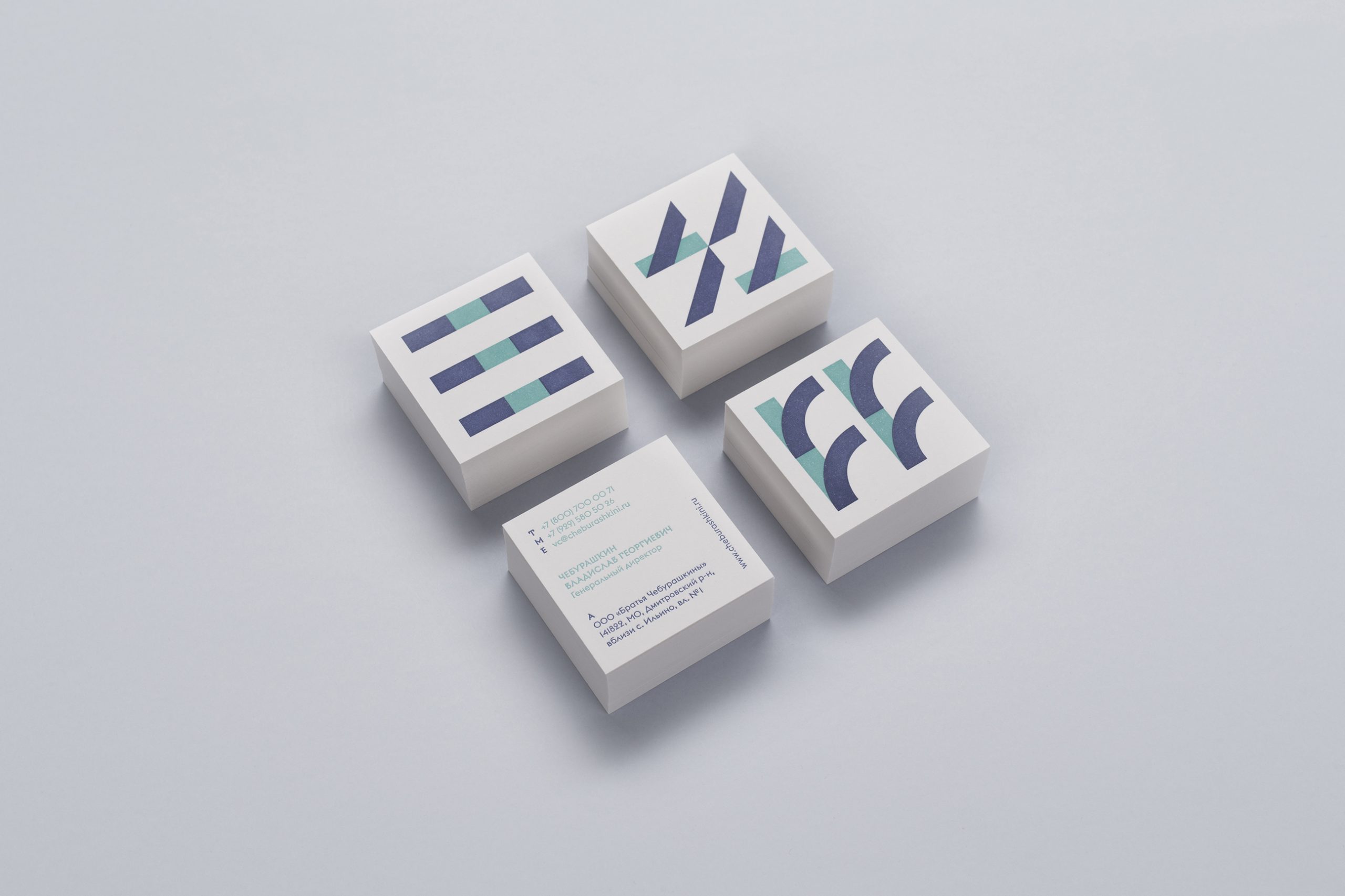
The main idea of identity is based on typography where initial letters of products are central elements of the design. The identity includes the packaging design of dairy products, stationary design, poster series, leaflets, navigation, motion design, interior and exterior design of the factory and other neighbouring factory buildings. The designers drew inspiration from ancient Slavic symbols, which mean seed, grass, earth and other farming symbols.
Cheburashkini Brothers Identity
Awards
Silver Award
Design & Craft
Corporate Brand Identity
Details
Categories:
Country:
Year:
Credits
Client:
Cheburashki Brothers. Family Farm
Agency:
Creative Director:
Vlad Ermolaev
Project Manager:
Victoria Ermolaeva
Technical designer:
Anastasia Chelishcheva


More Corporate Brand Identity Works
-
Nomination Design & Craft Corporate Brand Identity

EPDA: Packaging Turnover
Depot WPF
-
Nomination Design & Craft Corporate Brand Identity

Gira Icon System
schmitz Visuelle Kommunikation
-
Nomination Design & Craft Corporate Brand Identity

Kyrö Distillery Company
Werklig