
The typeface was designed as a part of the rebranding of Landsvirkjun’s (National power company of Iceland) The main goals are legibility, logic and maintaining Landsvirkjun’s characteristics through different media outlets.
LV Sans
Awards
Member Club Gold Award
Design
Typography
Details
Categories:
Country:
Year:

Credits
Client:
Landsvirkjun, National Power Company of Iceland
Agency:
Graphic Designer:
Atli Þór Árnason
Gabriel Markan
Hörður Lárusson
Simon Viðarsson


More Typography Works
-
Bronze Award Design TypographyShortlist Design Corporate Brand Identity
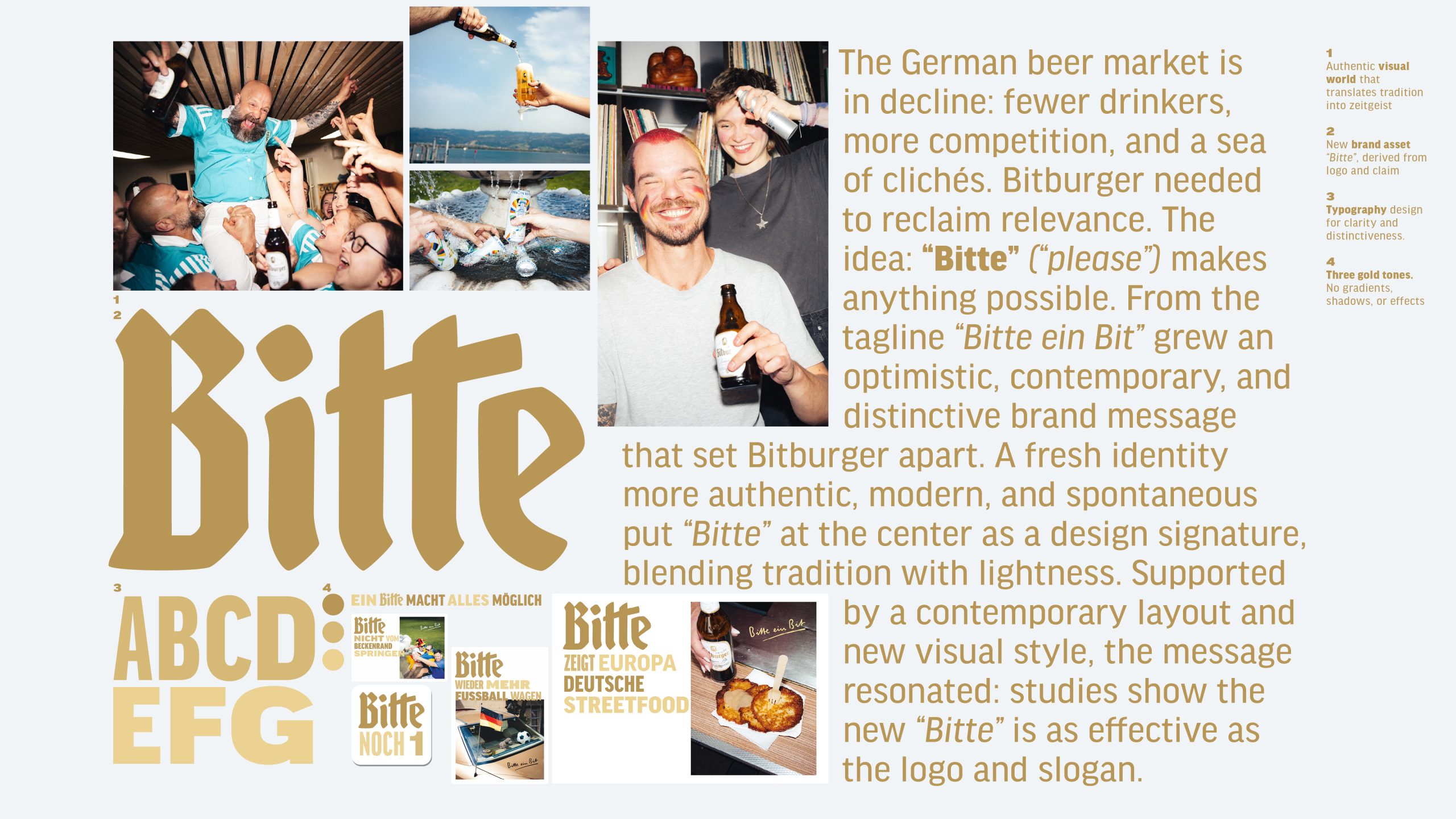
Bitburger Redesign – A ‘Bitte’ makes everything possible
SERVICEPLAN GERMANY / Munich
-
Silver Award Design Typography

M1 Radio – Custom Alphabet for a Cultural Icon
ANDSTUDIO / Vilnius
-
Silver Award Design Typography
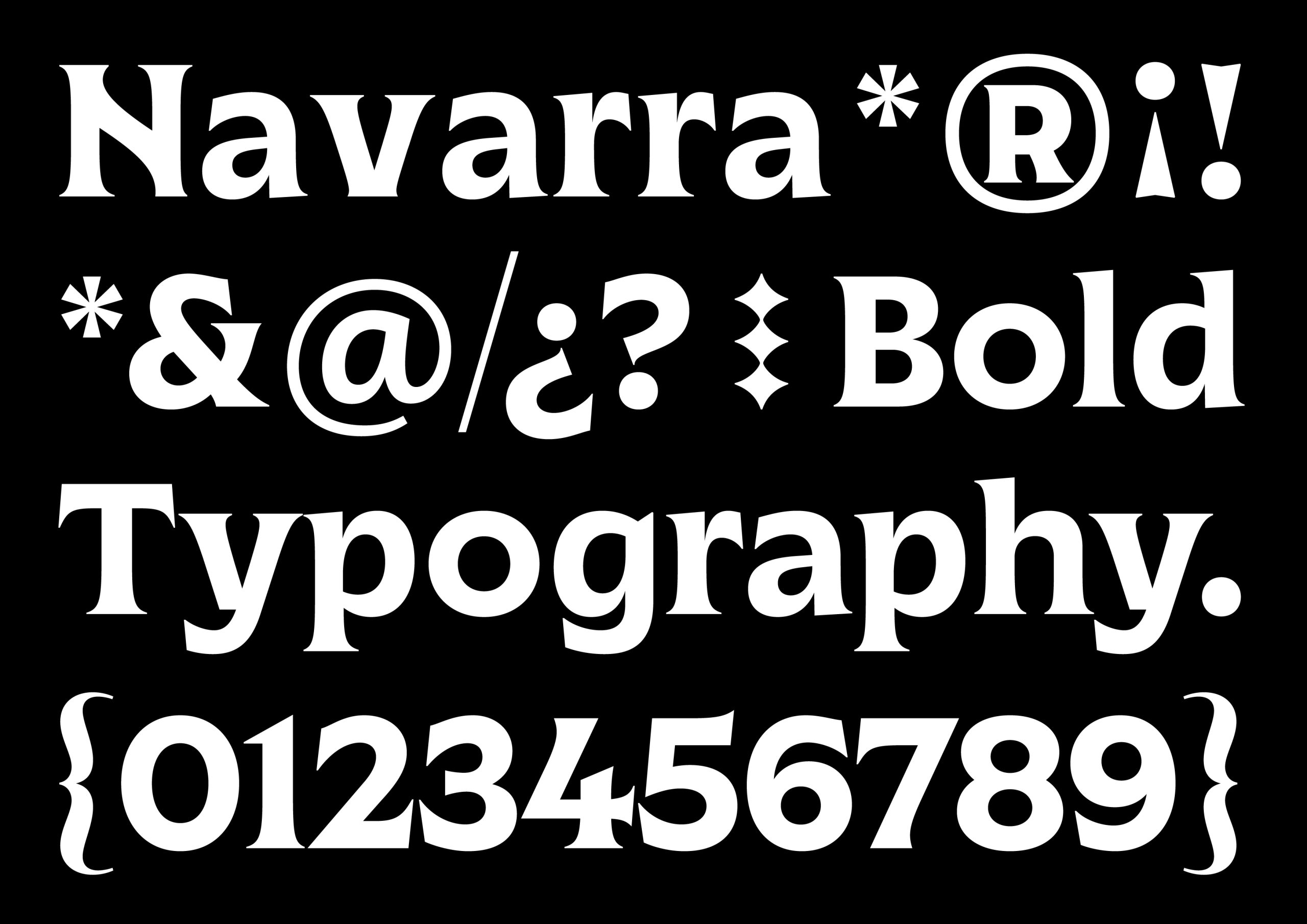
Marca Navarra
Prodigioso Volcán / Madrid