
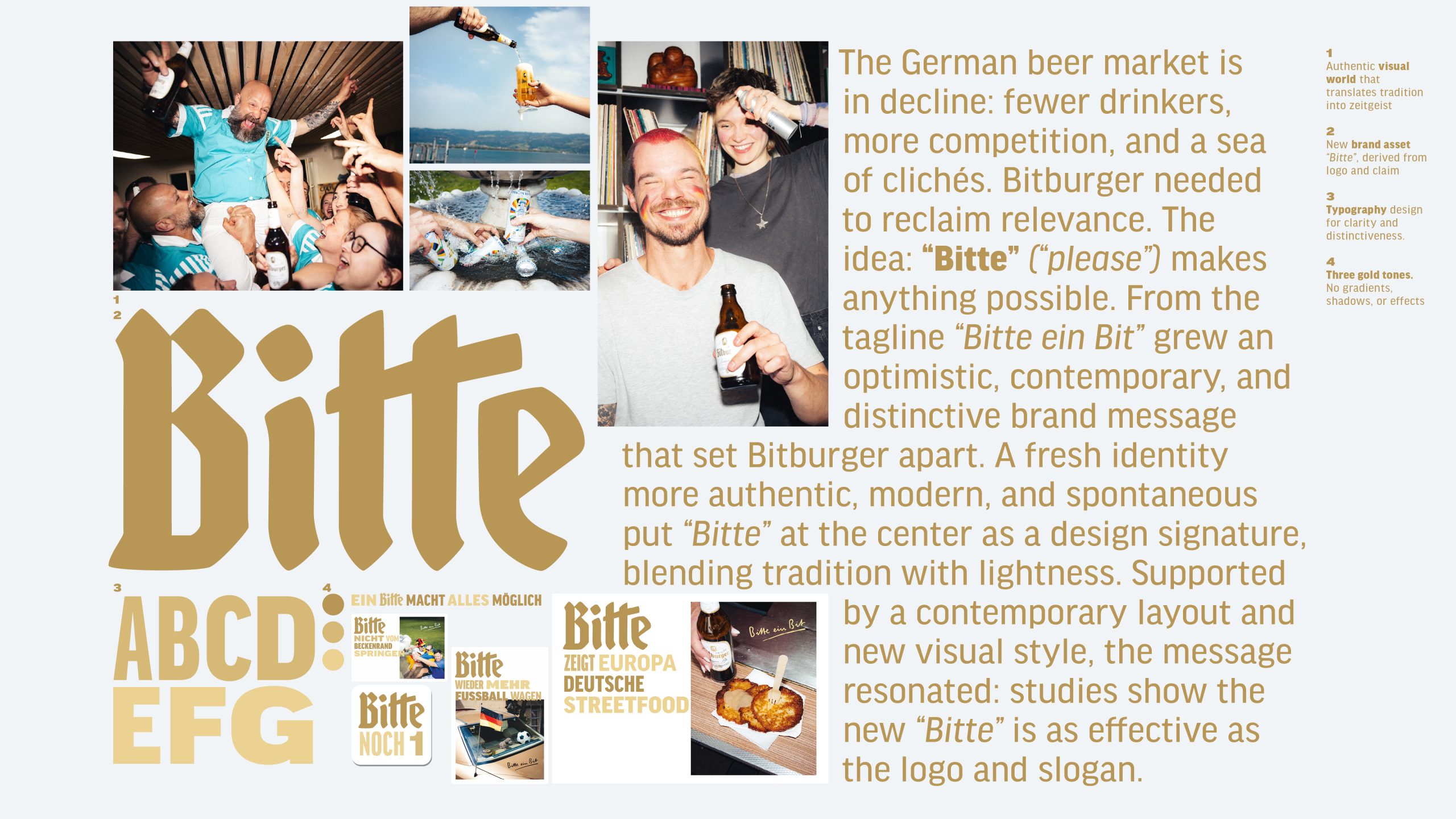
The German beer market is shrinking, with tougher competition and clichés everywhere. For Bitburger, the answer was “Bitte” (“please”). From the iconic “Bitte ein Bit” we created a fresh, optimistic message of respect, optimism, and togetherness. With a modern identity built around “Bitte”, uniting tradition and vibrancy, the brand regained cultural relevance. Studies show it’s as strong as Bitburger’s logo and claim.
Bitburger Redesign – A ‘Bitte’ makes everything possible
Awards
Bronze Award
Design
Typography
Shortlist
Design
Corporate Brand Identity
Details
Categories:
Country:
Year:
Credits
Client:
Bitburger
Agency:
Creative Director:
Sebastian Bialon


More Corporate Brand Identity Works
-
Shortlist Design Corporate Brand IdentityShortlist Design Packaging
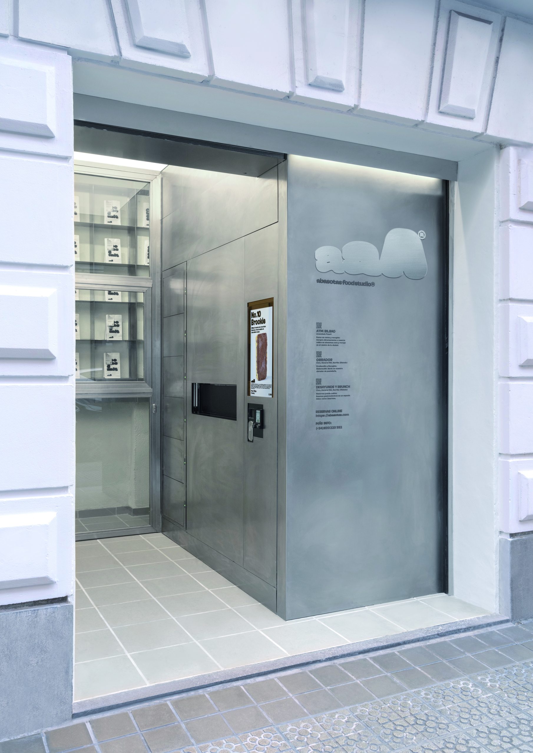
ABASOTAS FOOD STUDIO
PENSANDO EN BLANCO / HondarribiaABASOTAS FOOD STUDIO / BARRIKA
-
Shortlist Design Corporate Brand Identity
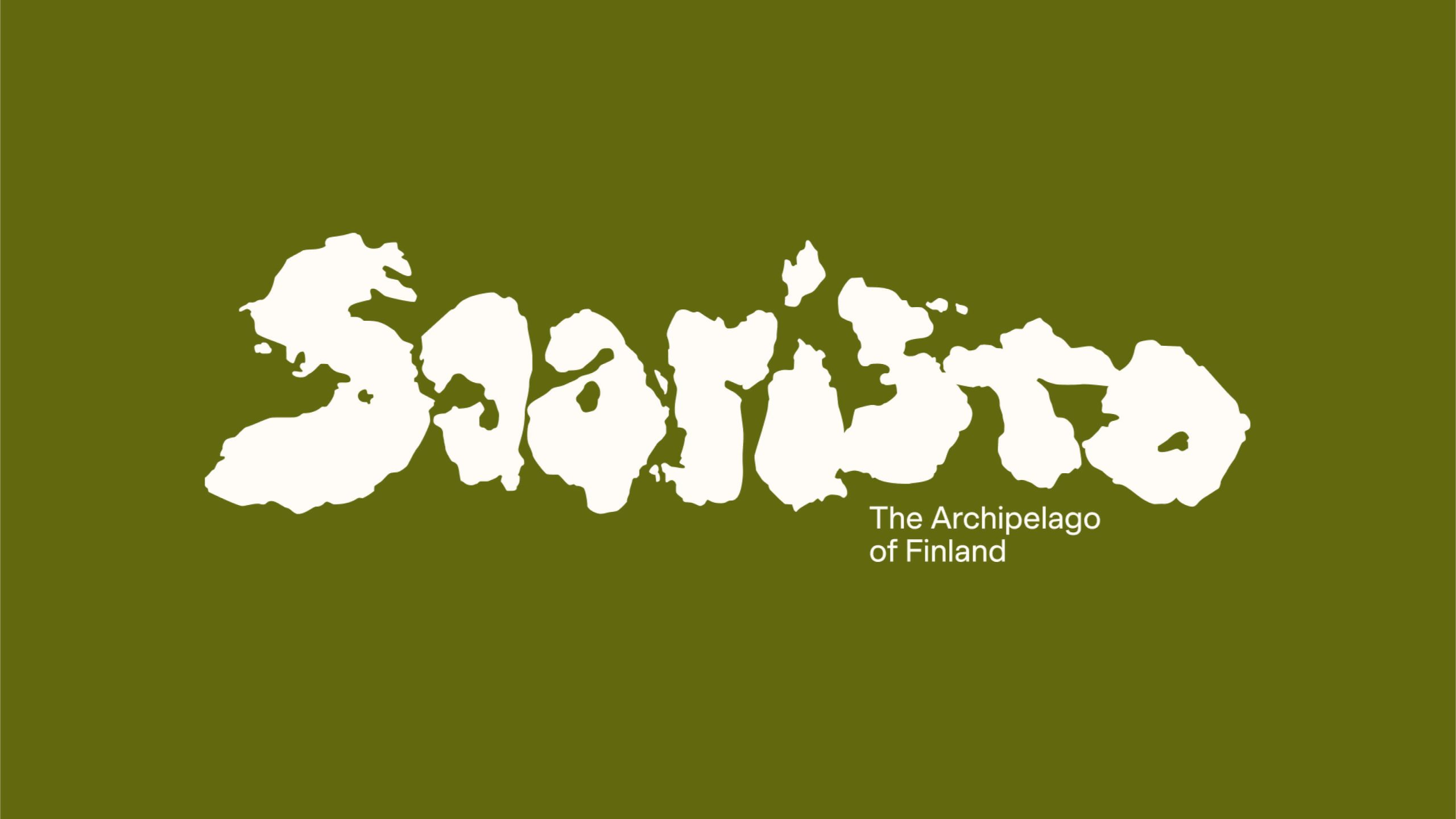
Saaristo Brand Identity
BOND Creative Agency / helsinkiVIsit Turku Archipelago / Turku
-
Shortlist Design Corporate Brand Identity
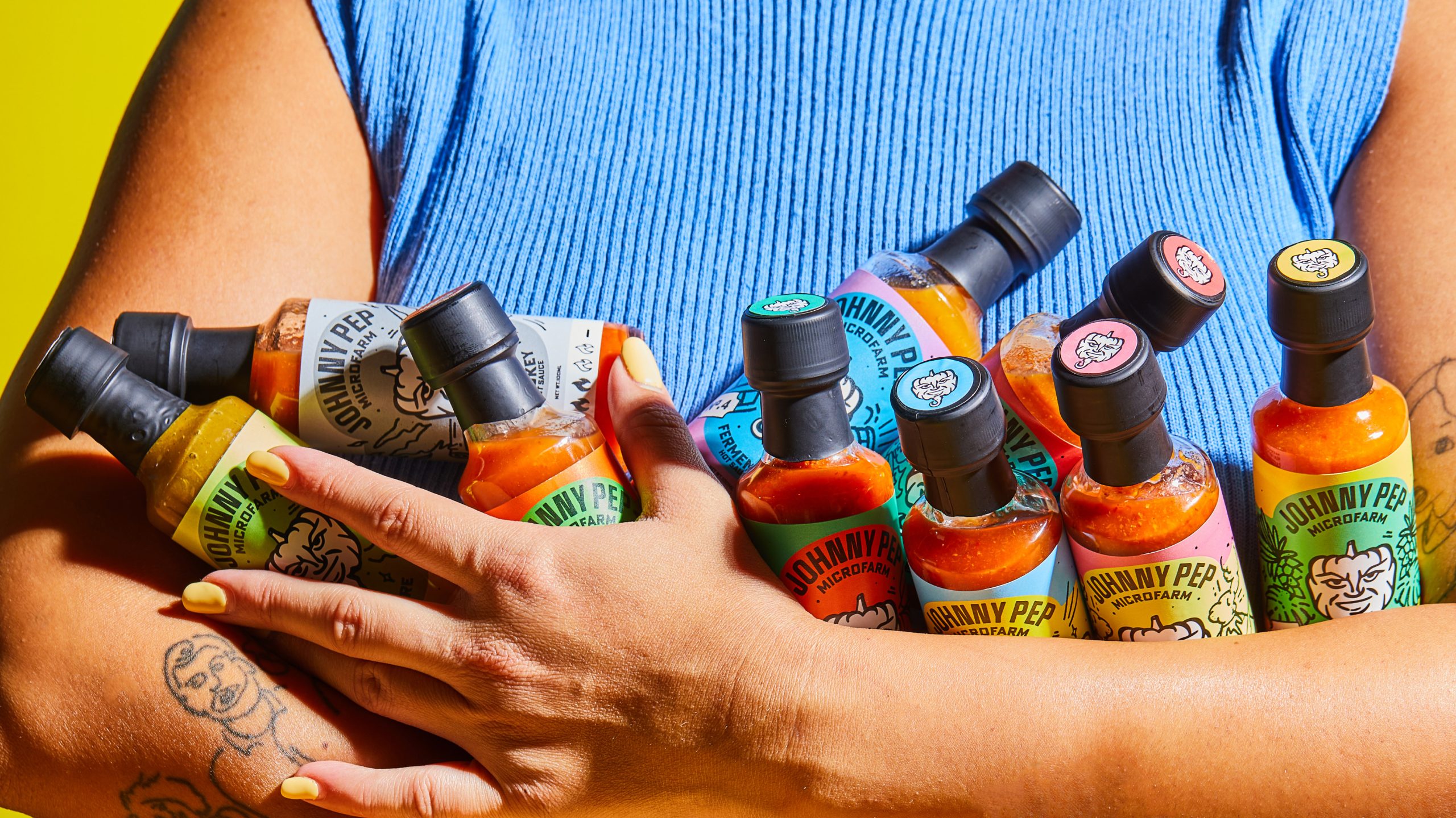
Johnny Pep Microfarm
Kleanthis Loizou / NicosiaStelios Demetriou / Nicosia