
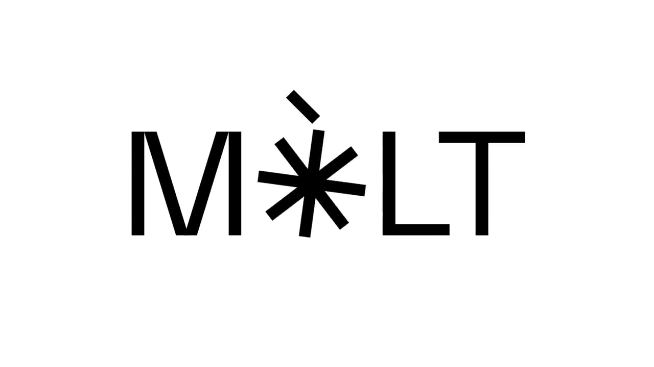
A brand created by the movement of a wheat grain mill. A modern way of representing the baking tradition. Mòlt deserved visibility. It would be redundant to say that the fluorescent red represents the fire and the grey the flour. The image simply seeks to convey values and personality. Making bread is easy, but making it different and putting a differential stamp on it is a more complex task. Conveying all this in a brand is “Mòlt” (a lot).
Mòlt. Obrador de pa
Awards
Bronze Award
Design
Logotype
Details
Categories:
Country:
Year:

Credits
Client:
Mòlt. Obrador de pa
Agency:
Art Director:
Migue Martí
Javi Tortosa Mateu
Designer:
Javi Tortosa Mateu
Migue Martí


More Logotype Works
-
Shortlist Design Logotype
20 Years of Casa da Música
Bastarda / Porto
-
Bronze Award Design Logotype
100
A EQUIPA / LisbonThe Other Studio / Lisbon
-
Silver Award Design Logotype

M1 Radio – Reviving the Golden-Age Logo for Today
ANDSTUDIO / Vilnius