
The M1 Radio rebrand began with its most recognisable asset – the 1989 logo. Still vivid in collective memory but visually dated, it was redrawn from the ground up. Proportions were refined, geometry sharpened and spacing rebalanced to perform across digital, broadcast and event formats. The result preserves the golden-age emblem’s cultural resonance while giving M1, M1+ and M1 Dance a single, contemporary mark of lasting precision and clarity.
M1 Radio – Reviving the Golden-Age Logo for Today
Awards
Silver Award
Design
Logotype
Details
Categories:
Country:
Year:

Credits
Client:
M1
Agency:


More Logotype Works
-
Shortlist Design Logotype
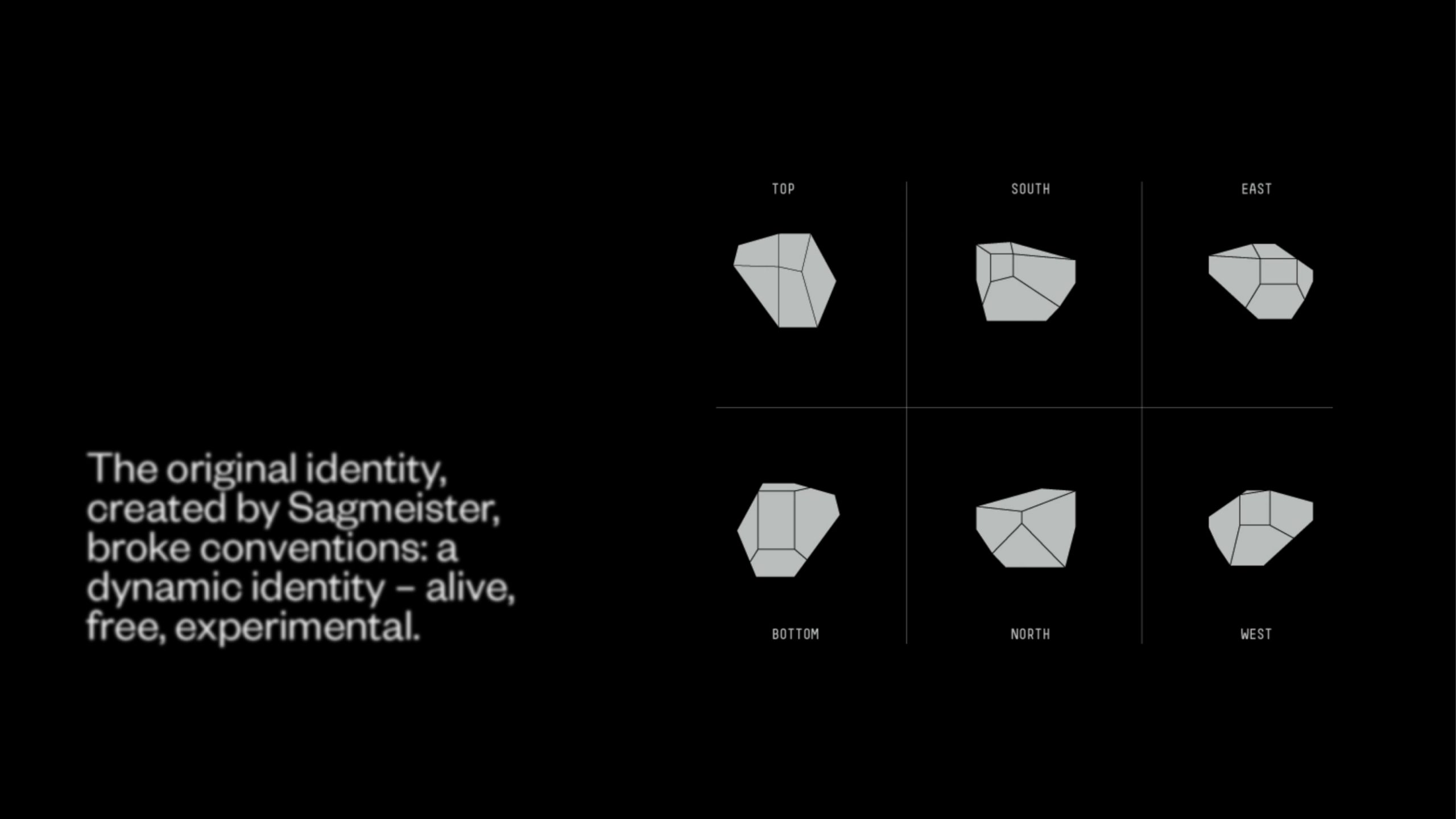
20 Years of Casa da Música
Bastarda / Porto
-
Bronze Award Design Logotype
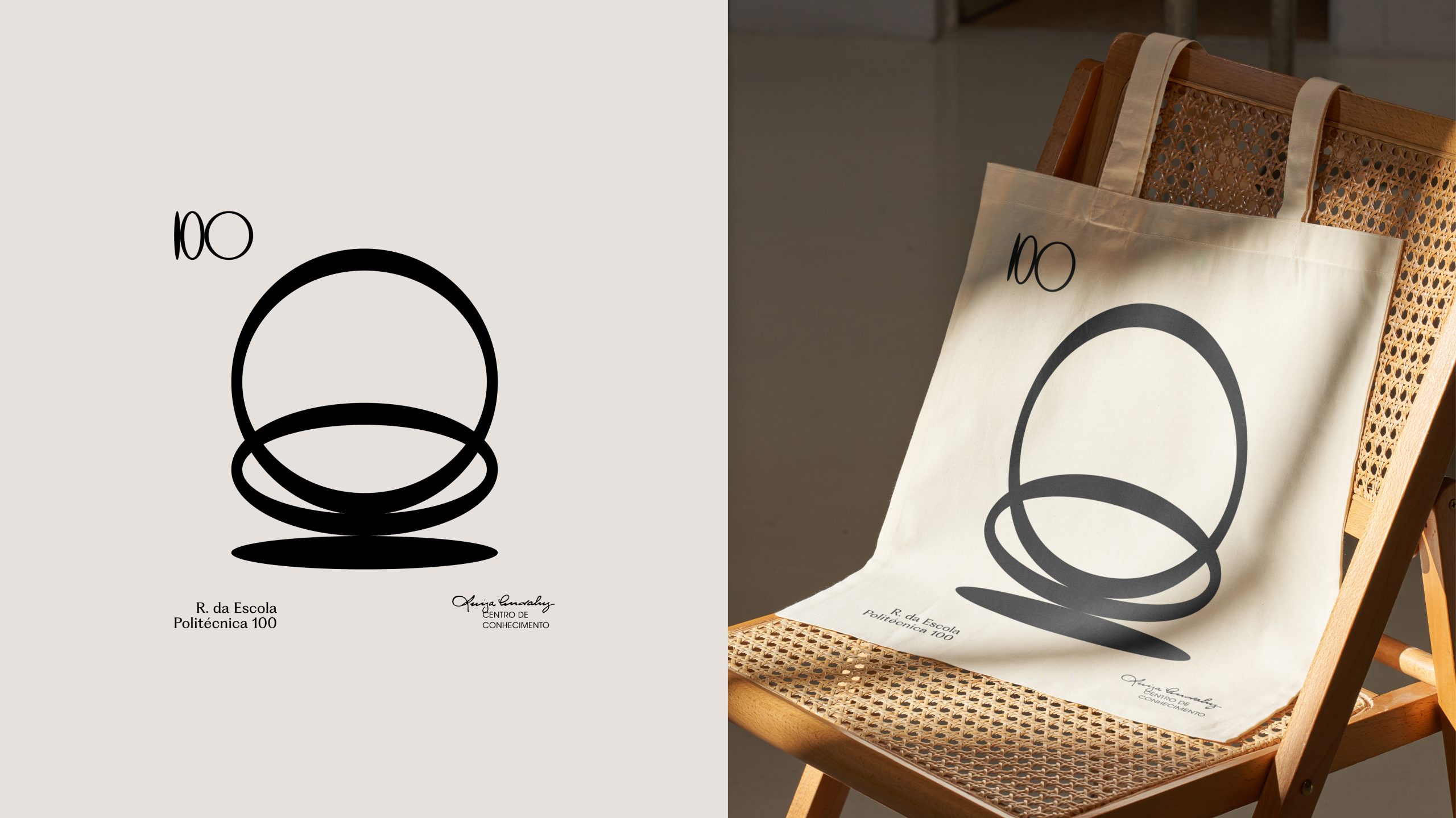
100
A EQUIPA / LisbonThe Other Studio / Lisbon
-
Gold Award Design Logotype
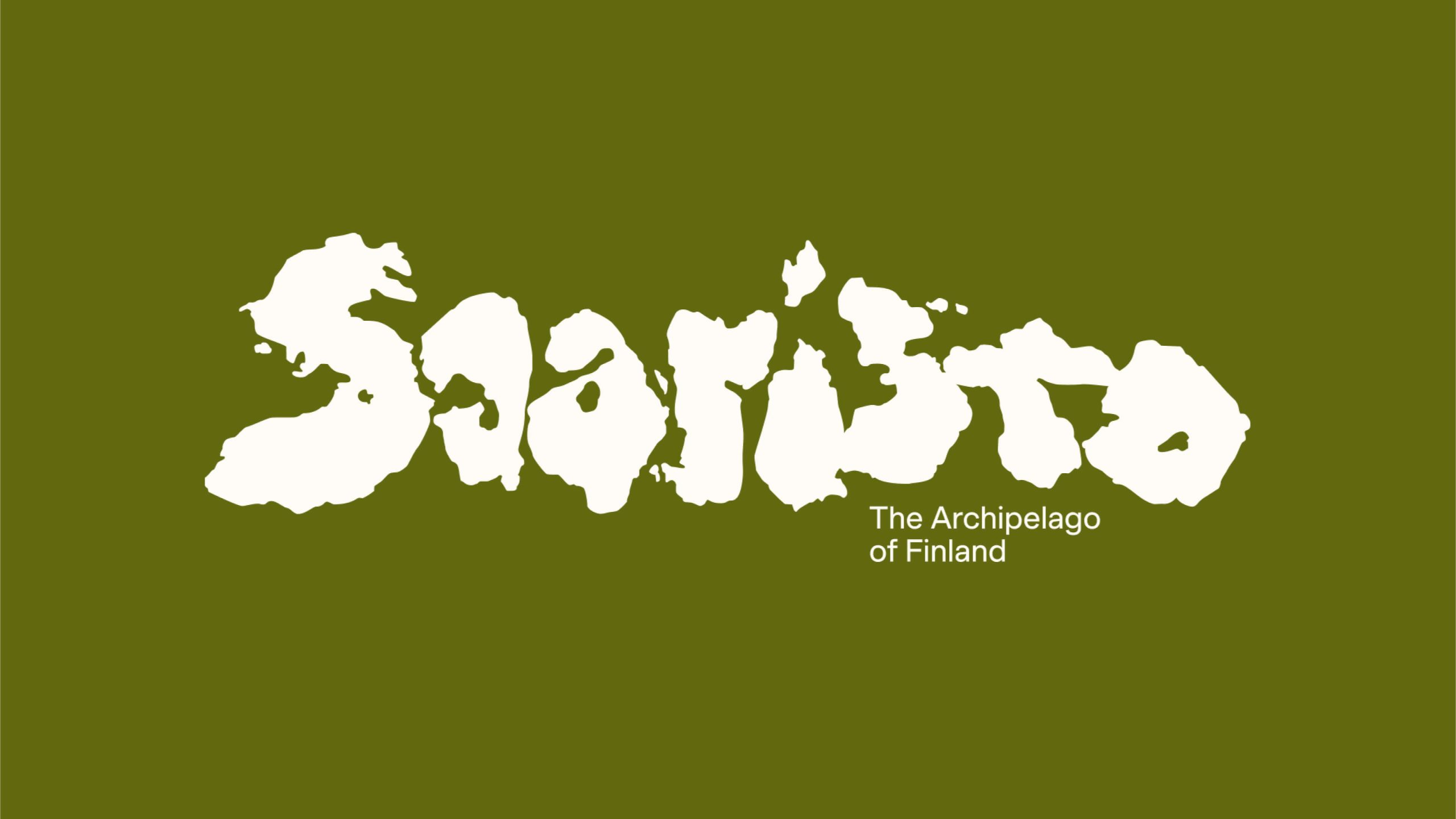
Saaristo – Logo
BOND Creative Agency / helsinkiVIsit Turku Archipelago / Turku