
A label as an index of vintages for all wine lovers and collectors. The series depicts the wine’s analytical data, including all the essential factors such as the age of the vines, the soil and the clones. It also features an imprint of value and aftertaste, communicating quality and systemically recording all unique features. A traditional letterpress technique was used for the printing. All data are written with a monospace typeface, GT America.
Warehouse ten
Awards
Nomination
Design
Packaging
Member Club Gold Award
Design
Packaging
Details
Categories:
Country:
Year:

Credits
Client:
Kir-Yianni
Agency:
Creative Director:
Dimitris Stefanidis
More Packaging Works
-
Silver Award Film & Audio Any OtherShortlist Design Packaging
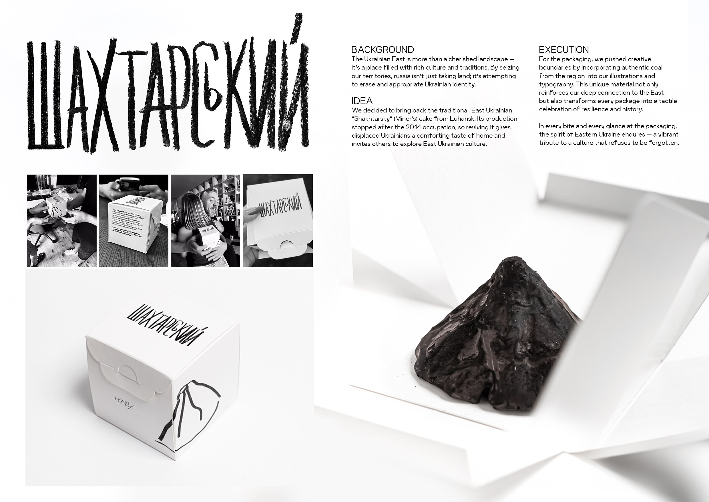
Reclaiming the East
Postmen / Kyiv
-
Shortlist Design Packaging
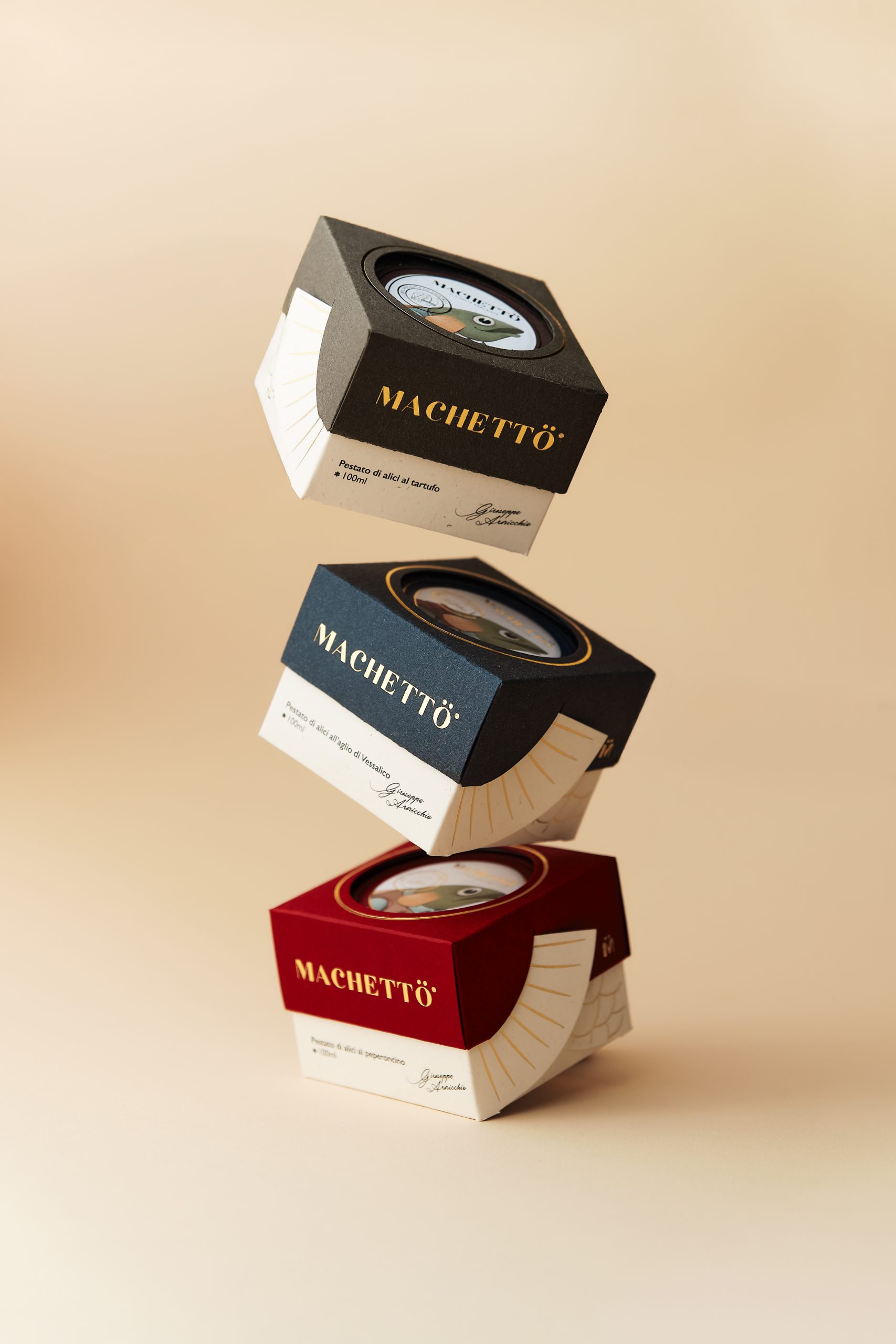
Machetto – tales of taste
Idea Studio © / Cava de'Tirreni
-
Shortlist Design Packaging

MANIN
PENSANDO EN BLANCO / HondarribiaMANIN Y SUS MUCHACHOS / EL BUSTO