
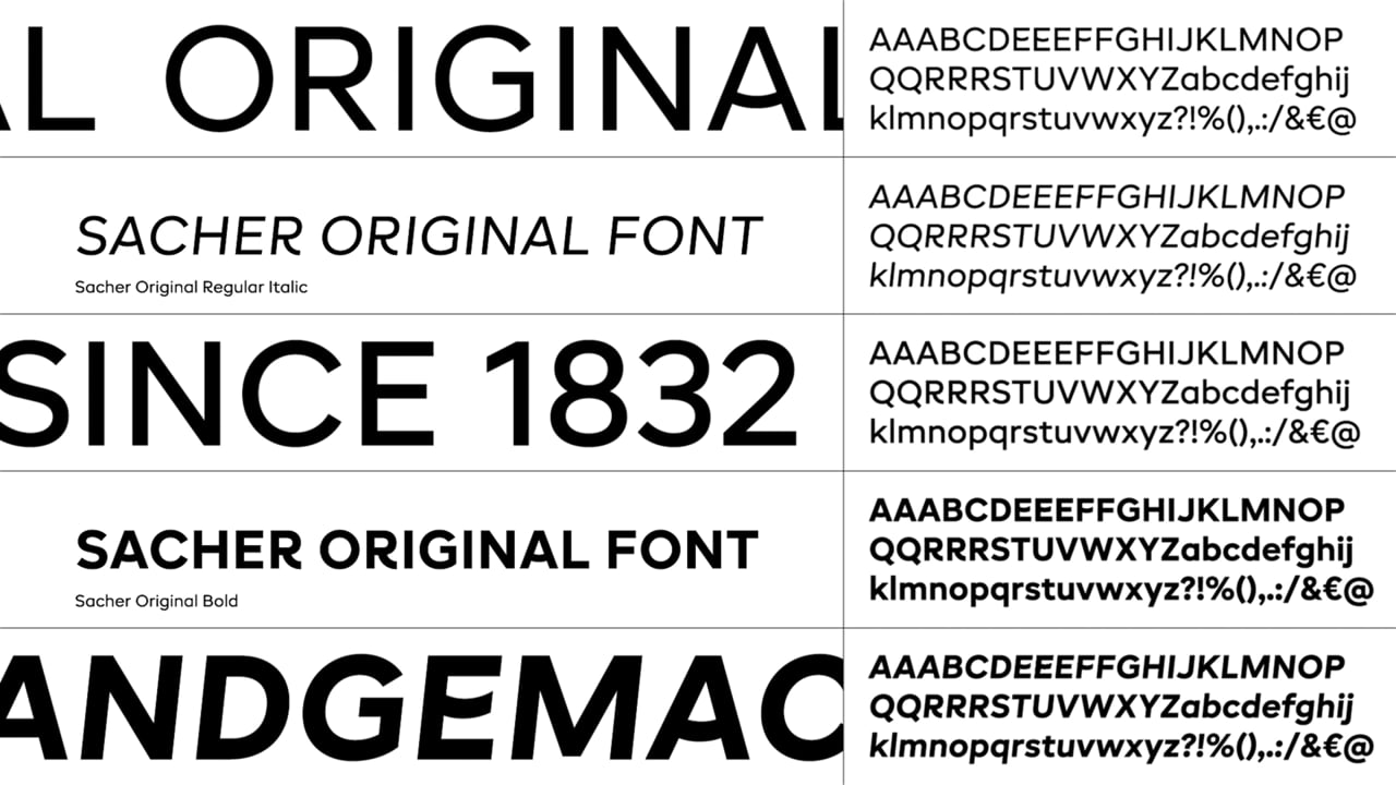
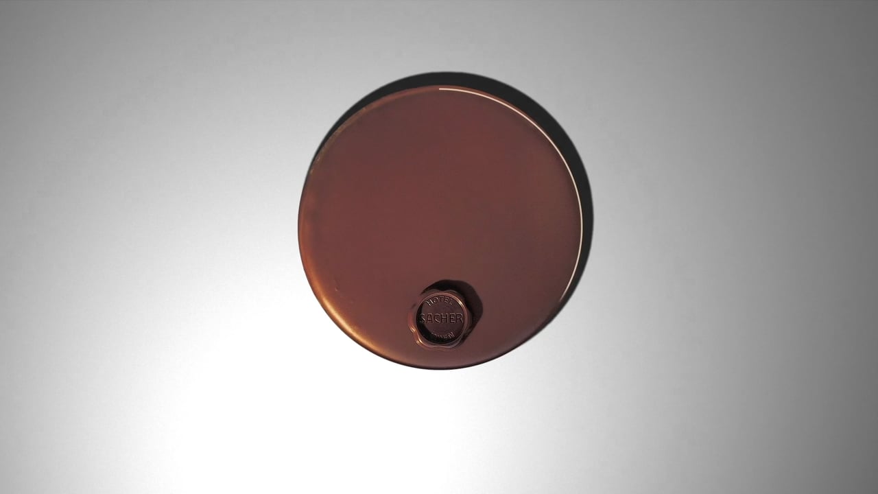
Sacher is more than a brand, it is part of Austrian culture. It all started with the original Sacher Torte in 1832 and it is still an essential part of the Sacher DNA. In the Redesign everything is based on the shape of the original Sacher Torte. From the logo to a specially developed font: the Sacher Original Sans. Dozens of original Sacher cakes were scanned to measure their specific circular shapes. Alternative Glyphs create a varied typeface.
Sacher
Awards
Bronze Award
Design
Typography
Bronze Award
Design
Corporate Brand Identity
Details
Categories:
Country:
Year:
Credits
Client:
Sacher Hotels Betriebsgesellschaft mbH
Agency:
Art Director:
Roland Radschopf
Copywriter:
Nikolaus Link
Creative Director:
Roland Radschopf
Other:
Alexander Hoffmann
Aurelia Schönbauer
Photographer:
Julius Hirtzberger


More Corporate Brand Identity Works
-
Shortlist Design Corporate Brand IdentityShortlist Design Packaging
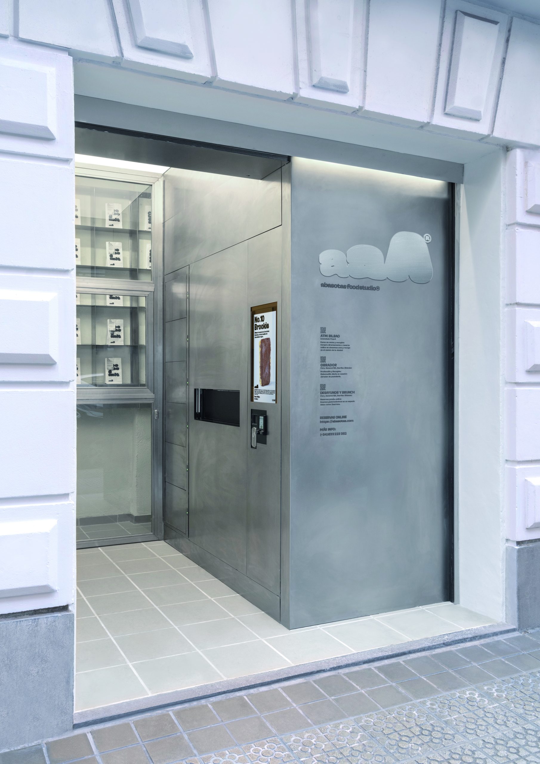
ABASOTAS FOOD STUDIO
PENSANDO EN BLANCO / HondarribiaABASOTAS FOOD STUDIO / BARRIKA
-
Shortlist Design Corporate Brand Identity
Saaristo Brand Identity
BOND Creative Agency / helsinkiVIsit Turku Archipelago / Turku
-
Shortlist Design Corporate Brand Identity

Johnny Pep Microfarm
Kleanthis Loizou / NicosiaStelios Demetriou / Nicosia