
If there is a crunch behind the deer, it means that the deer is stalking here. Or rather, that the Hotel Zum Hirschen will be revitalized. The deer gives way to a corporate font that takes the antlers as a theme, but reproduces them in a new way. The role of the women, who have played a key role in the hotel’s history, is also given more space. The deer becomes a mask and is worn by a woman. Feminine instead of masculine, vegetarian cuisine instead of game on the menu.
Hirschen Hotel Corporate Font
Awards
Silver Award
Design
Typography
Details
Categories:
Country:
Year:

Credits
Client:
Hirschen Hotel Corporate Font
Agency:


More Typography Works
-
Bronze Award Design TypographyShortlist Design Corporate Brand Identity
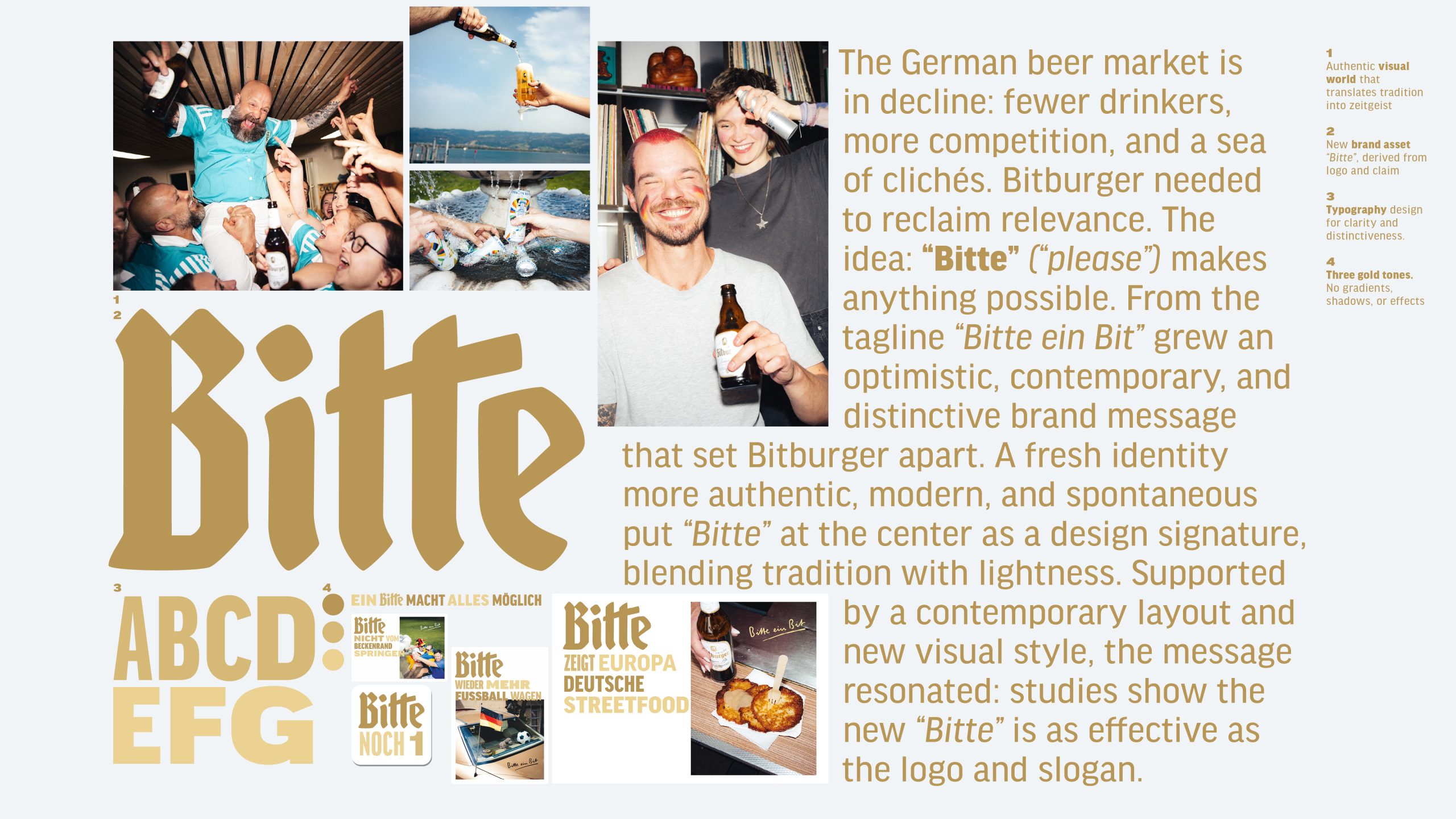
Bitburger Redesign – A ‘Bitte’ makes everything possible
SERVICEPLAN GERMANY / Munich
-
Silver Award Design Typography

M1 Radio – Custom Alphabet for a Cultural Icon
ANDSTUDIO / Vilnius
-
Silver Award Design Typography
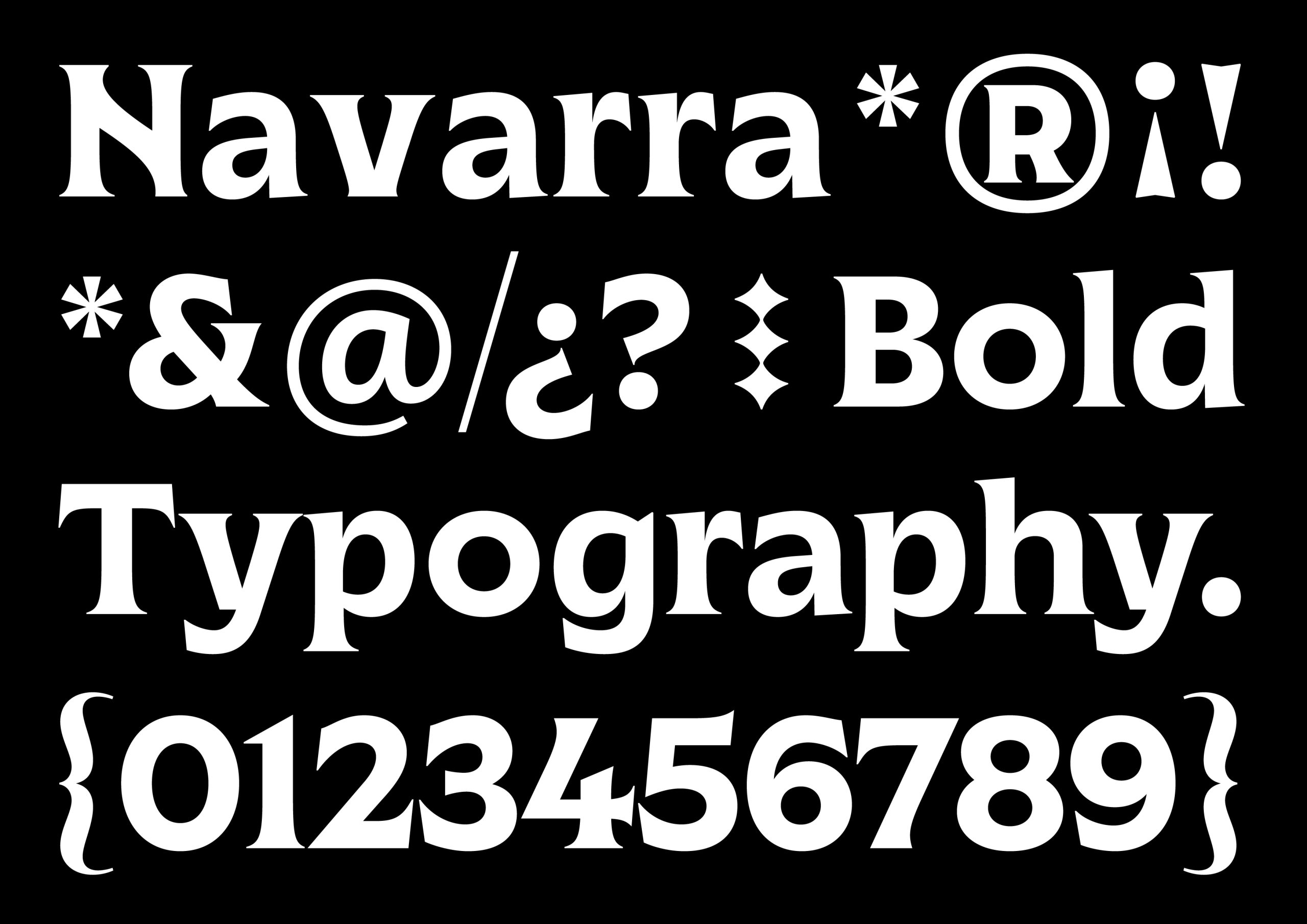
Marca Navarra
Prodigioso Volcán / Madrid