
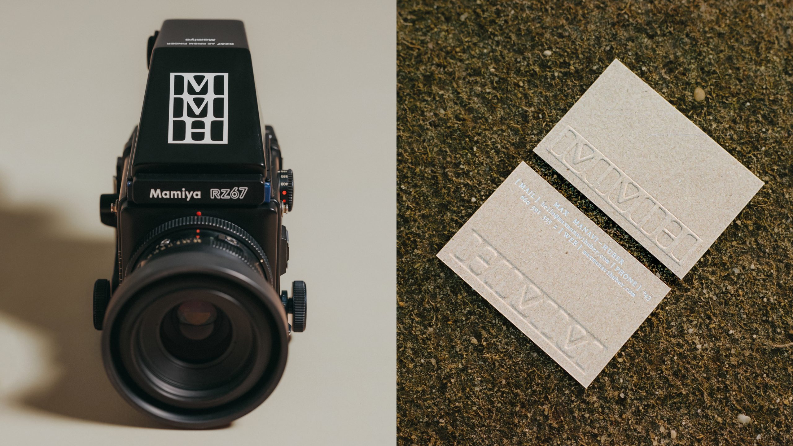
Max Manavi-Huber’s photos evolve from his passion for motion and emotion. Inspired by Max’s love for analog photography, the logo is based on the simplified shape of analog film frames. Designed in portrait & landscape format for optimal usage. The stationery pairs textured papers with metallic foil. Compliment cards feature unique photo prints of Max’s work. The website echoes the logo’s structure, with a numbered index highlighting the character of an analog negative.
Max Manavi-Huber
Awards
Silver Award
Design
Corporate Brand Identity
Details
Categories:
Country:
Year:
Credits
Client:
Max Manavi-Huber
Agency:


More Corporate Brand Identity Works
-
Shortlist Design Corporate Brand IdentityShortlist Design Packaging
ABASOTAS FOOD STUDIO
PENSANDO EN BLANCO / HondarribiaABASOTAS FOOD STUDIO / BARRIKA
-
Shortlist Design Corporate Brand Identity

Johnny Pep Microfarm
Kleanthis Loizou / NicosiaStelios Demetriou / Nicosia
-
Shortlist Design Corporate Brand Identity
Saaristo Brand Identity
BOND Creative Agency / helsinkiVIsit Turku Archipelago / Turku