
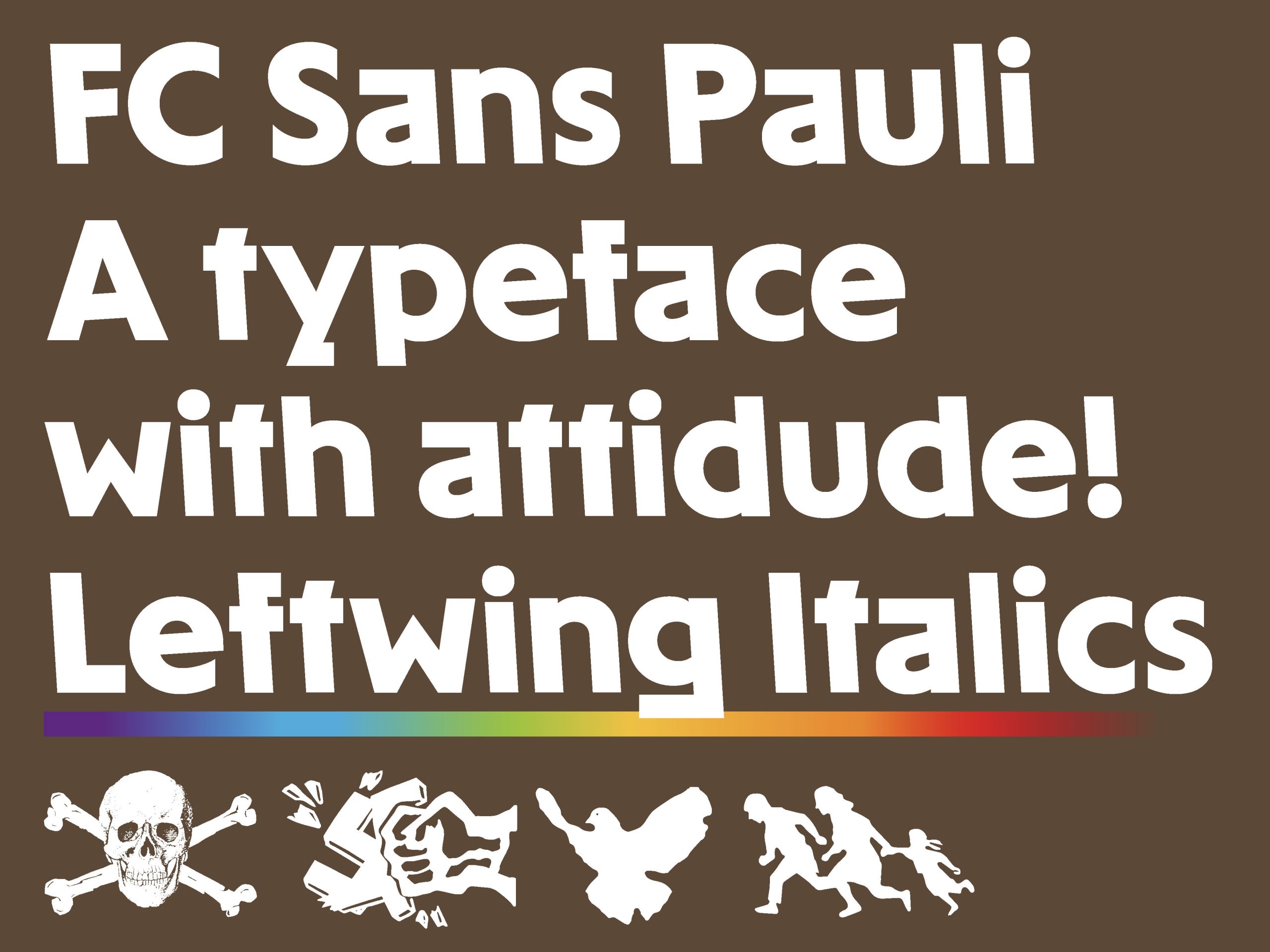
FC St. Pauli – one of the brightest brands in German football – has stood for decades against fascism and racism, for democracy and human rights. Its own typeface, FC Sans Pauli, makes this stance visible in every glyph: back-slanted, left-leaning, activist. With 13 styles, accessibility features, support for 383 languages and cultural details like the Antifa @ or a ligature honoring graffiti legend OZ, typography becomes part of the club’s DNA.
FC Sans Pauli – The First Typeface With a Conscience
Awards
Gold Award
Design
Typography
Details
Categories:
Country:
Year:
Credits
Client:
FC St. Pauli von 1910 e.V.
Agency:
Typographer:
Christoph Koeberlin


More Typography Works
-
Bronze Award Design TypographyShortlist Design Corporate Brand Identity
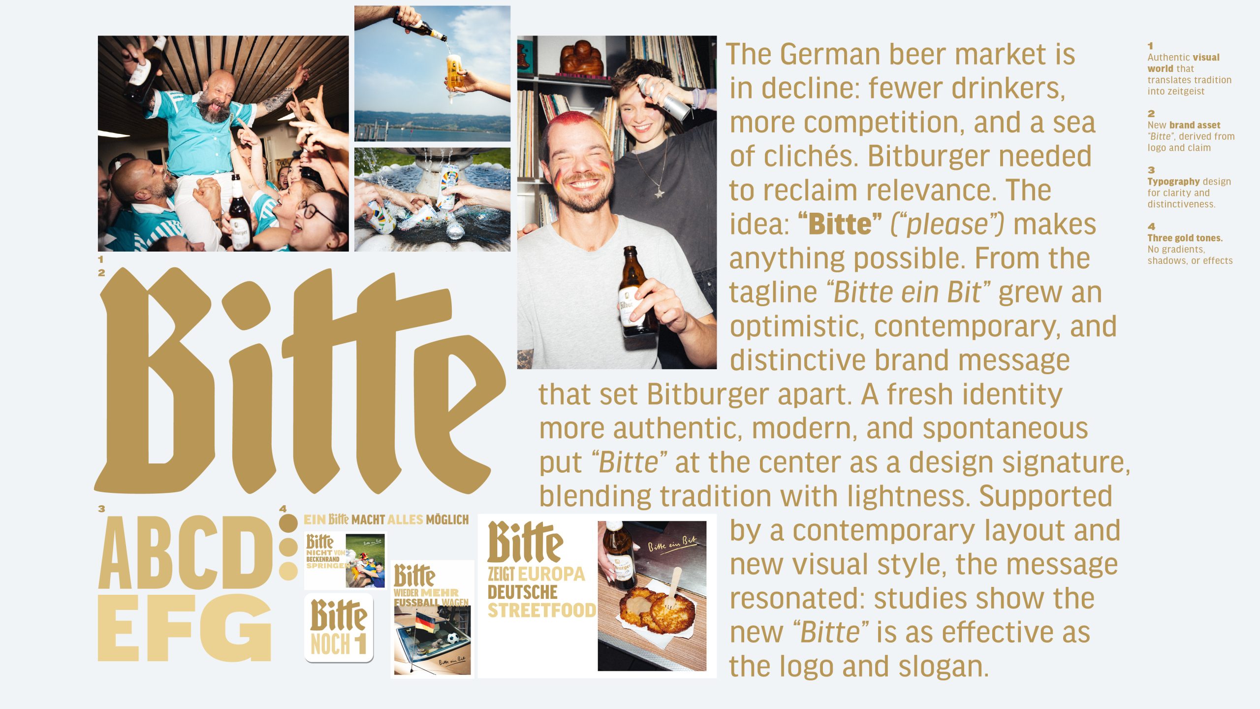
Bitburger Redesign – A ‘Bitte’ makes everything possible
SERVICEPLAN GERMANY / Munich
-
Silver Award Design Typography

M1 Radio – Custom Alphabet for a Cultural Icon
ANDSTUDIO / Vilnius
-
Silver Award Design Typography
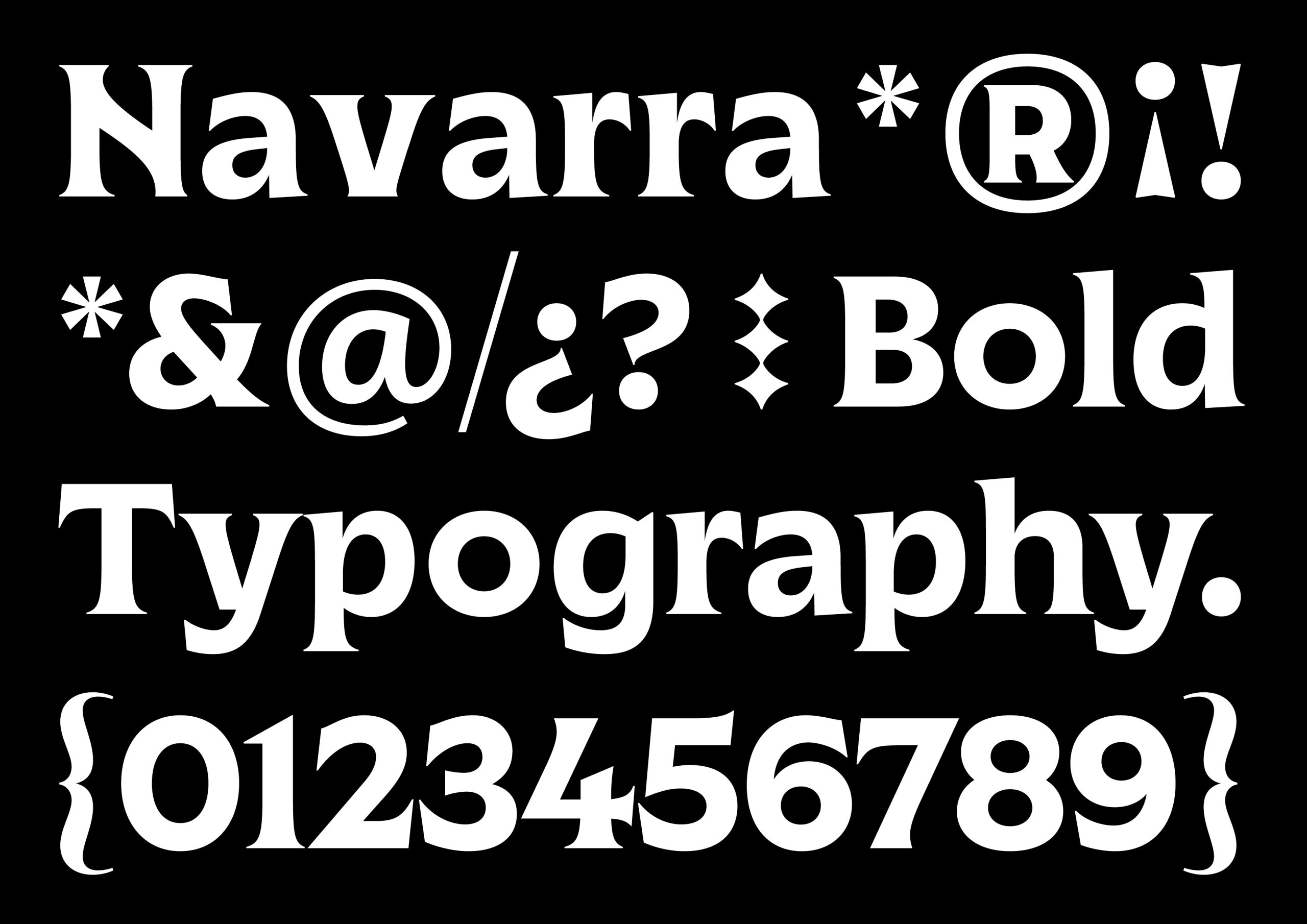
Marca Navarra
Prodigioso Volcán / Madrid