
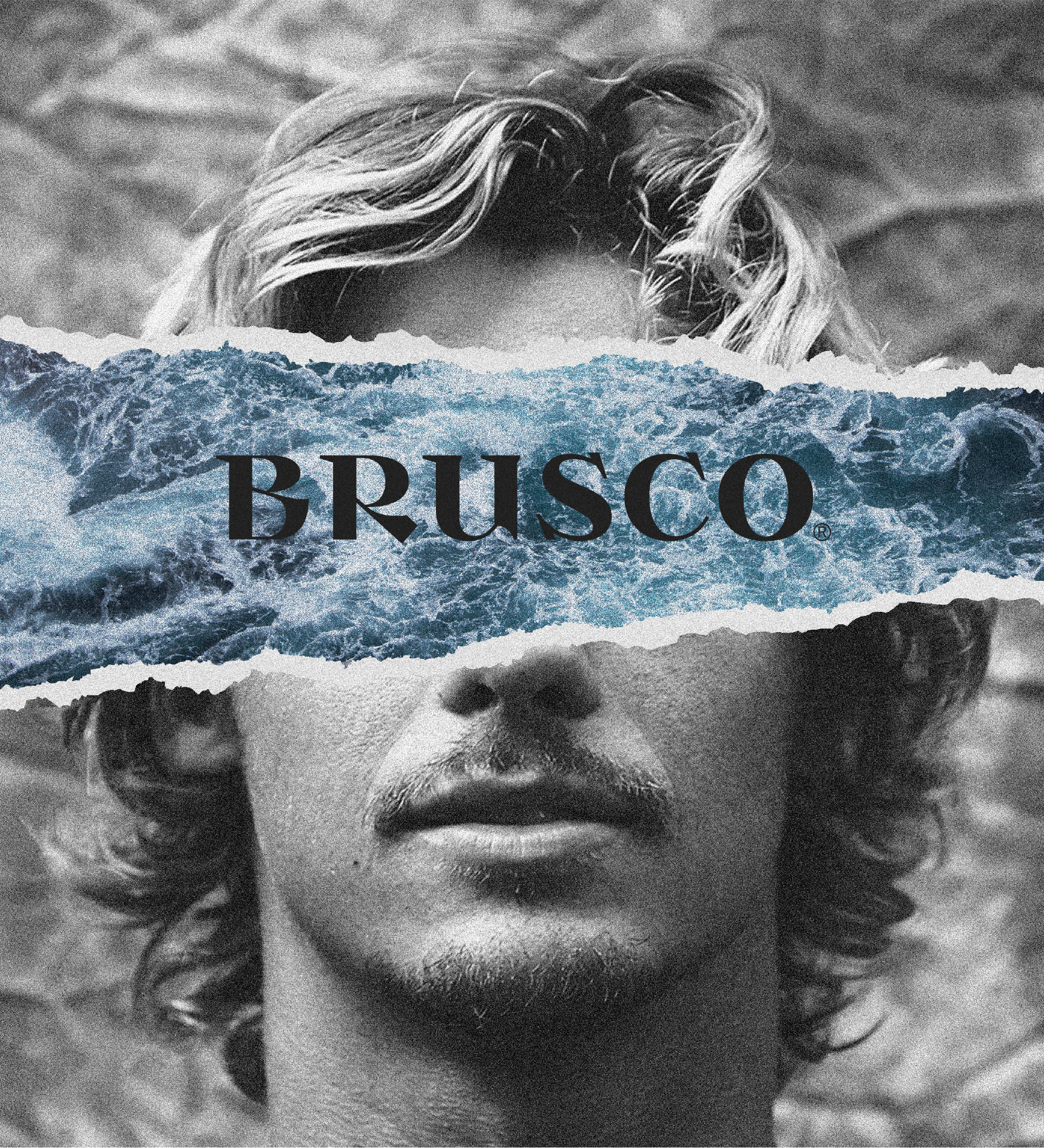
Inspired by rough sea, the texture of BRUSCO’s Tail Pads and Leashes guarantees maximum adherence in critical waves. The packaging follows BRUSCO’s emotional nature. The sound of opening the bundle, akin to waves washing against the shore, echoes the pronunciation of the brand name itself. The typeface is robust, heavy and curvilinear. Twirls from the Atlantic are represented by the contrasting shapes reminiscent of the harsh sensation of waves hitting the coast.
BRUSCO
Awards
Nomination
Design
Packaging
Nomination
Design
Typography
Member Club Gold Award
Design
Corporate Brand Identity
Details
Categories:
Country:
Year:
Credits
Client:
Outhere Sports
Agency:
Art Director:
Filipe Mesquita
Pedro Mesquita
Pedro Serrão
Creative Director:
Filipe Mesquita
Pedro Mesquita
Pedro Serrão
Designer:
Pedro Mesquita
Filipe Mesquita
Pedro Serrão
Director of Photography:
Nuno Moreira
João Sousa
Film Director:
João Sousa
PRO Surfer:
Nic Von Rupp
Miguel Blanco
Photographer:
João Sousa
Nuno Moreira
Type Edition:
Luis Bondovas


More Corporate Brand Identity Works
-
Silver Award Film & Audio Any OtherShortlist Design Packaging
Reclaiming the East
Postmen / Kyiv
-
Shortlist Design Packaging
Machetto – tales of taste
Idea Studio © / Cava de'Tirreni
-
Shortlist Design Packaging

MANIN
PENSANDO EN BLANCO / HondarribiaMANIN Y SUS MUCHACHOS / EL BUSTO