
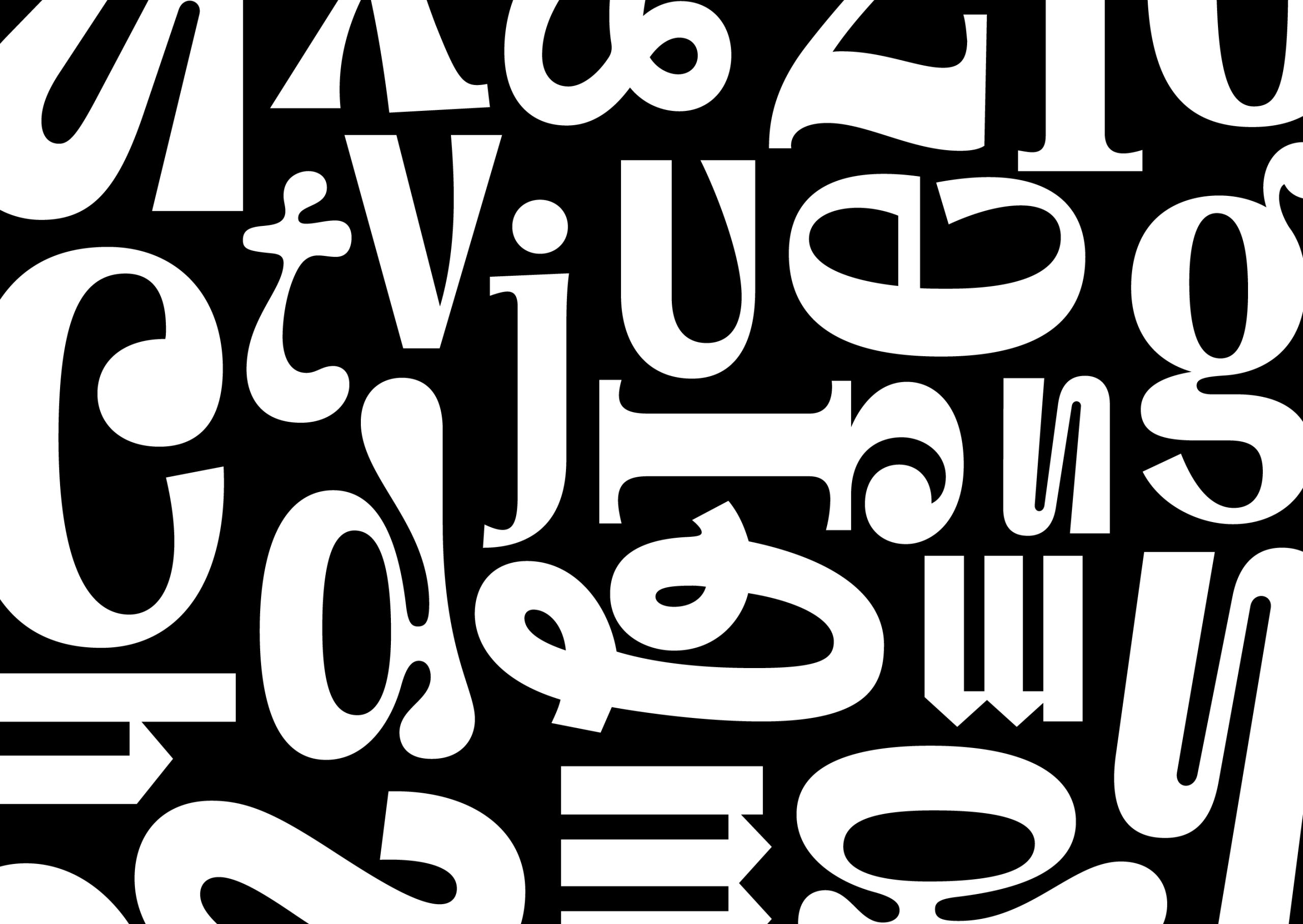
Task: The challenge is to develop the core design of the new season at Theater Bielefeld, based on the given motto “ach”. Idea: A key visual is created as the central element, which represents a typographic realization of the motto. As a counterpart to the heterogeneity of the motto, three diverse letter forms are developed. Solution: Based on the basic idea of implementing the motto as a key visual, an alphabet was developed as a tool to create communication materials.
Custom-Type “ach”
Awards
Shortlist
Design
Typography
Details
Categories:
Country:
Year:
Credits
Client:
Theater Bielefeld
Agency:
Creative Director:
Christoph Beier


More Typography Works
-
Bronze Award Design TypographyShortlist Design Corporate Brand Identity
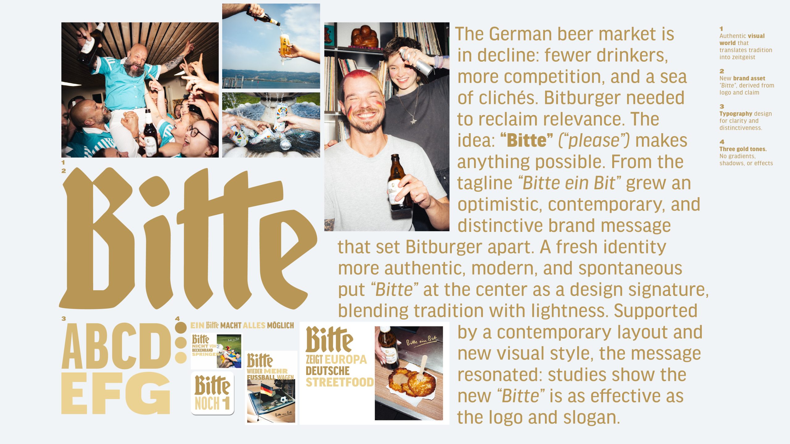
Bitburger Redesign – A ‘Bitte’ makes everything possible
SERVICEPLAN GERMANY / Munich
-
Silver Award Design Typography

M1 Radio – Custom Alphabet for a Cultural Icon
ANDSTUDIO / Vilnius
-
Silver Award Design Typography
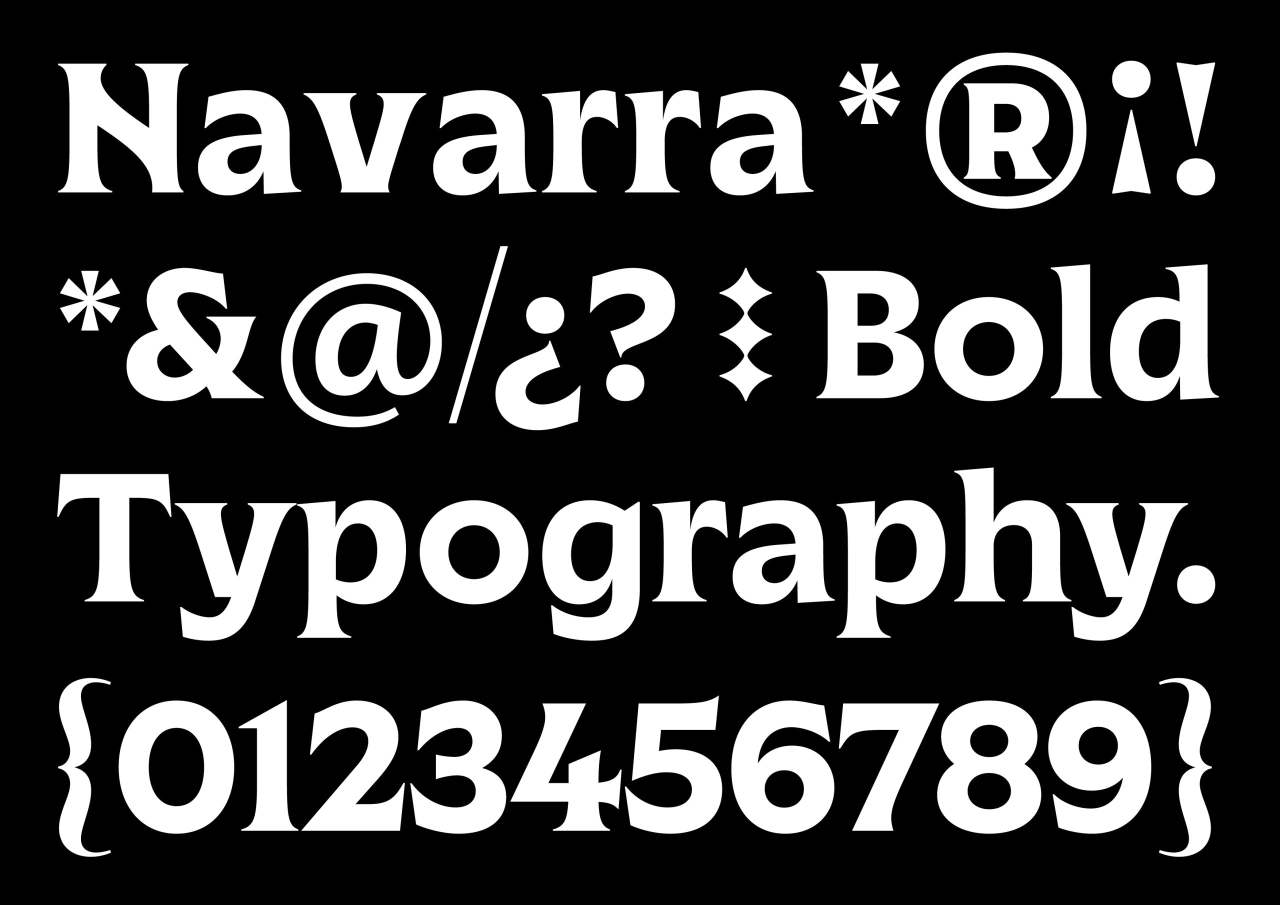
Marca Navarra
Prodigioso Volcán / Madrid