
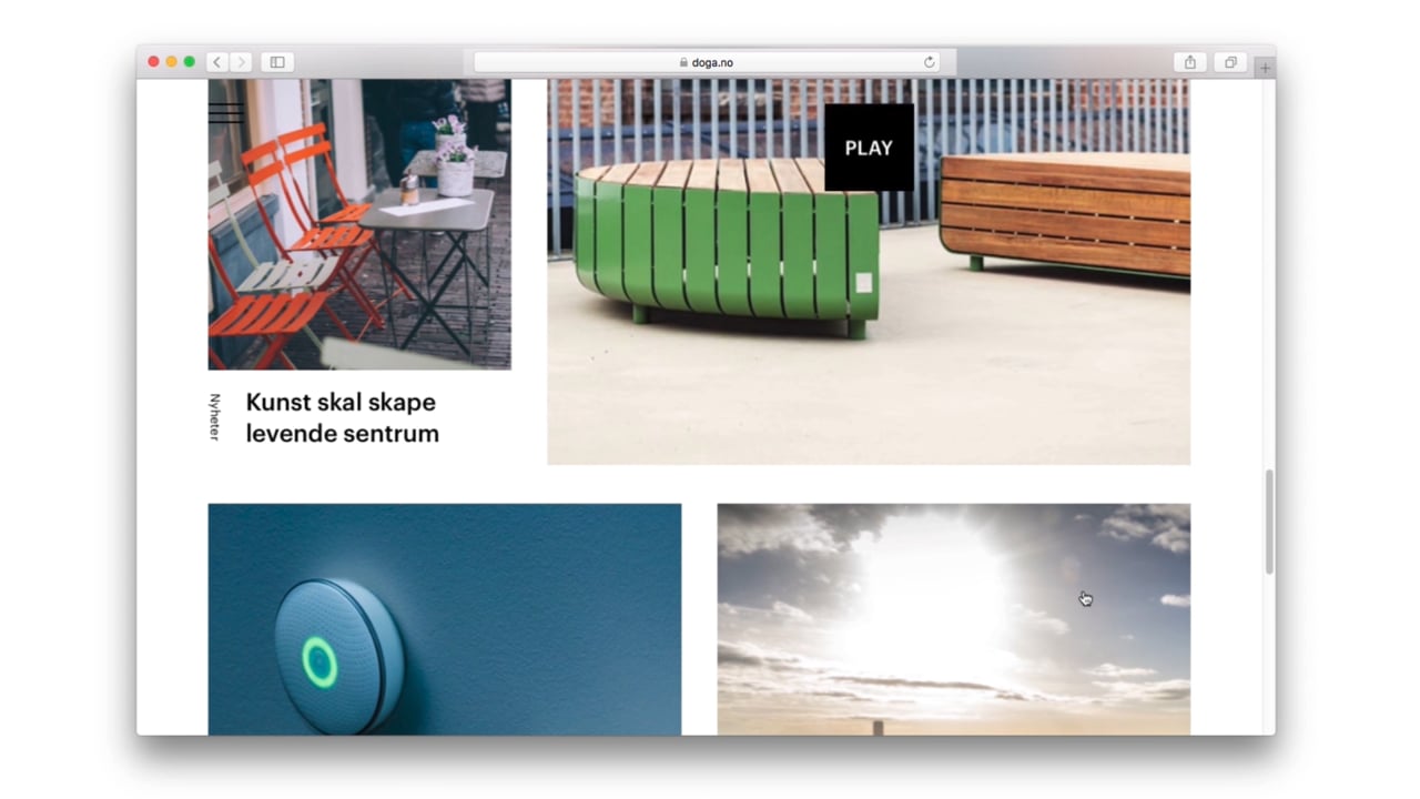
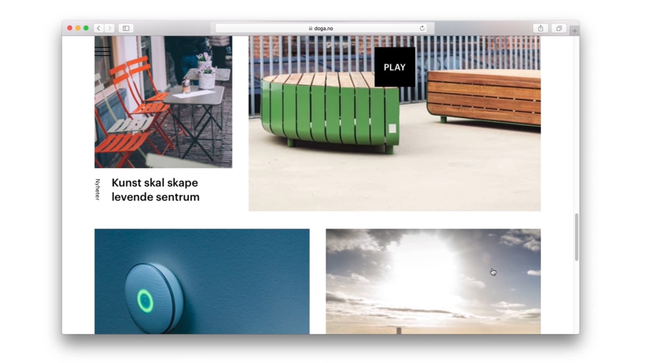
DOGA represents the various design and architecture disciplines in the way the logo comes to life, adapting itself to digital formats, in 2D and 3D as well as printed materials. The highlight of DOGA’s identity is its new logo. The letters act as visual cornerstones, creating shape and substance, depending on the point of view. The logo and identity hints at DOGA’s ambition to be an arena for possibilities.
DOGA – Design and Architecture Norway
Awards
Silver Award
Graphic Design
Corporate Brand Identity
Member Club Gold Award
Graphic Design
Corporate Brand Identity
Details
Categories:
Country:
Year:
Credits
Client:
DOGA – Design and Architecture Norway
Agency:
Creative Strategy:
Stein Sørlie
Designer:
Marc Ligeti
Heidi Bakken
Stein Øvre
Front End Designer:
Asbjørn Hegdahl
More Corporate Brand Identity Works
-
Member Club Gold Award Graphic Design Corporate Brand Identity
-
Member Club Gold Award Graphic Design Corporate Brand Identity

Smor Premium Milk Butter
Loukas Chondros
-
Member Club Gold Award Graphic Design Corporate Brand Identity

Markedet
Skogen