
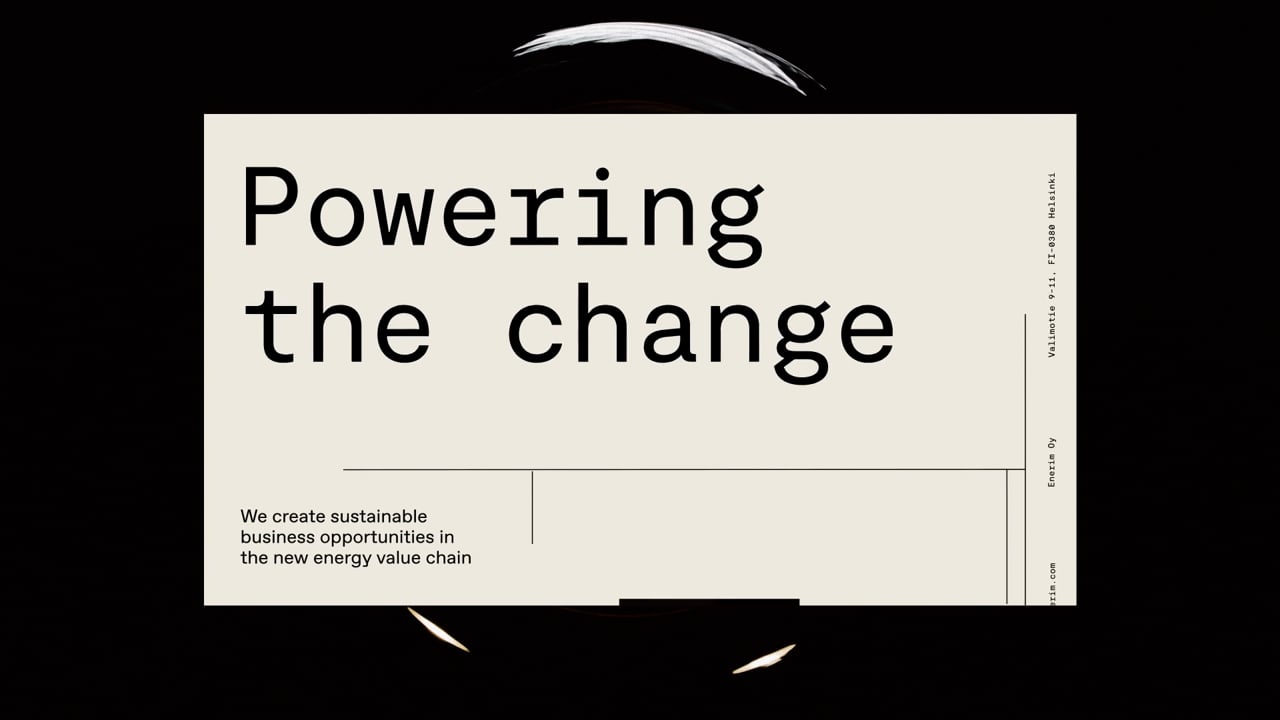
Together we helped Enerim redefine their purpose and articulate their belief in a world where everyone deserves clean energy. The visual system is defined by an uplifting colour set, a modern mono-grotesque brand font & rhythmically pulsating circular shapes as a metaphor for the sun, our main source of energy. Additionally the layouts are held together by grid lines meant to evoke electrical grids under & above the ground, providing the energy for our everyday lives.
Enerim
Awards
Member Club Gold Award
Design
Corporate Brand Identity
Details
Categories:
Country:
Year:

Credits
Client:
Enerim
Agency:
Brand Startegist:
Jason Hill
Designer:
Phuc Doan
József Gergely Kiss
Developer:
Antti Huovinen
Project Manager:
Emma Autio
Service Designer:
Maija Mäenpää
UI Designer:
Johannes Pokkinen


More Corporate Brand Identity Works
-
Shortlist Design Corporate Brand IdentityShortlist Design Packaging
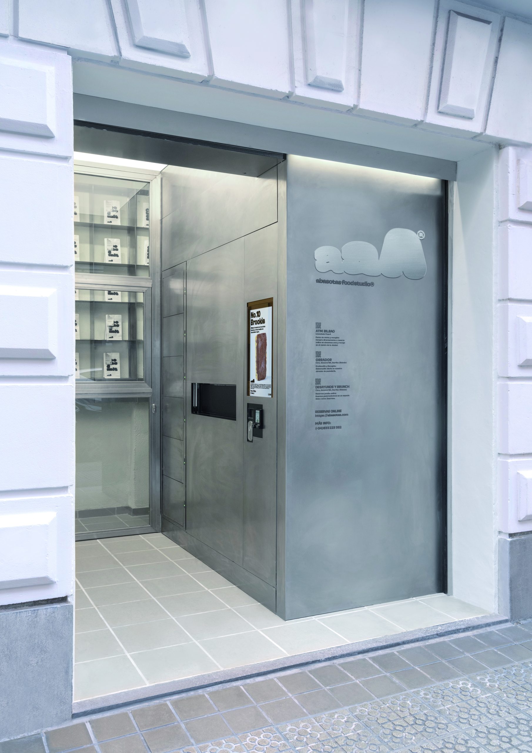
ABASOTAS FOOD STUDIO
PENSANDO EN BLANCO / HondarribiaABASOTAS FOOD STUDIO / BARRIKA
-
Shortlist Design Corporate Brand Identity
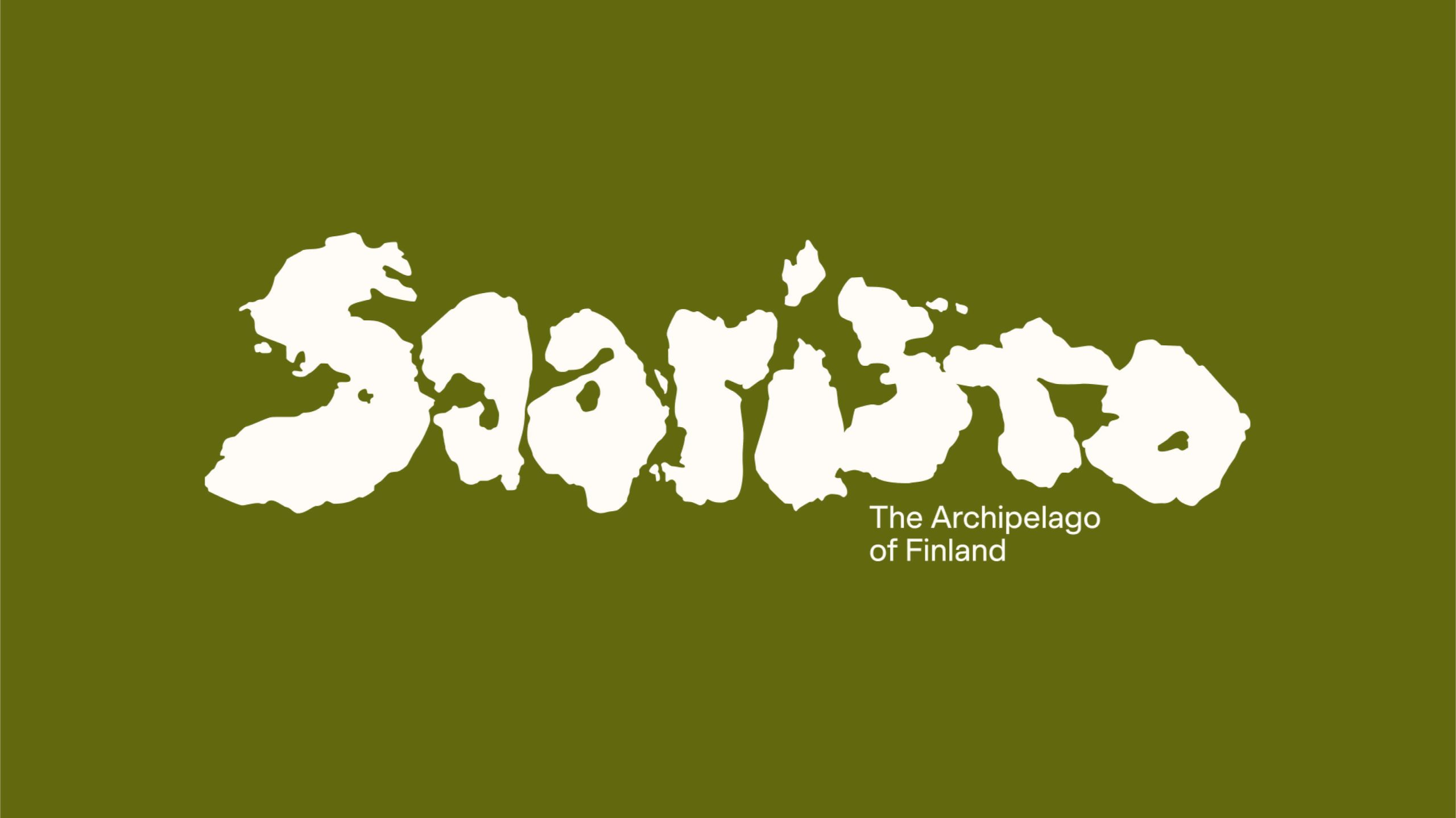
Saaristo Brand Identity
BOND Creative Agency / helsinkiVIsit Turku Archipelago / Turku
-
Shortlist Design Corporate Brand Identity

Johnny Pep Microfarm
Kleanthis Loizou / NicosiaStelios Demetriou / Nicosia