
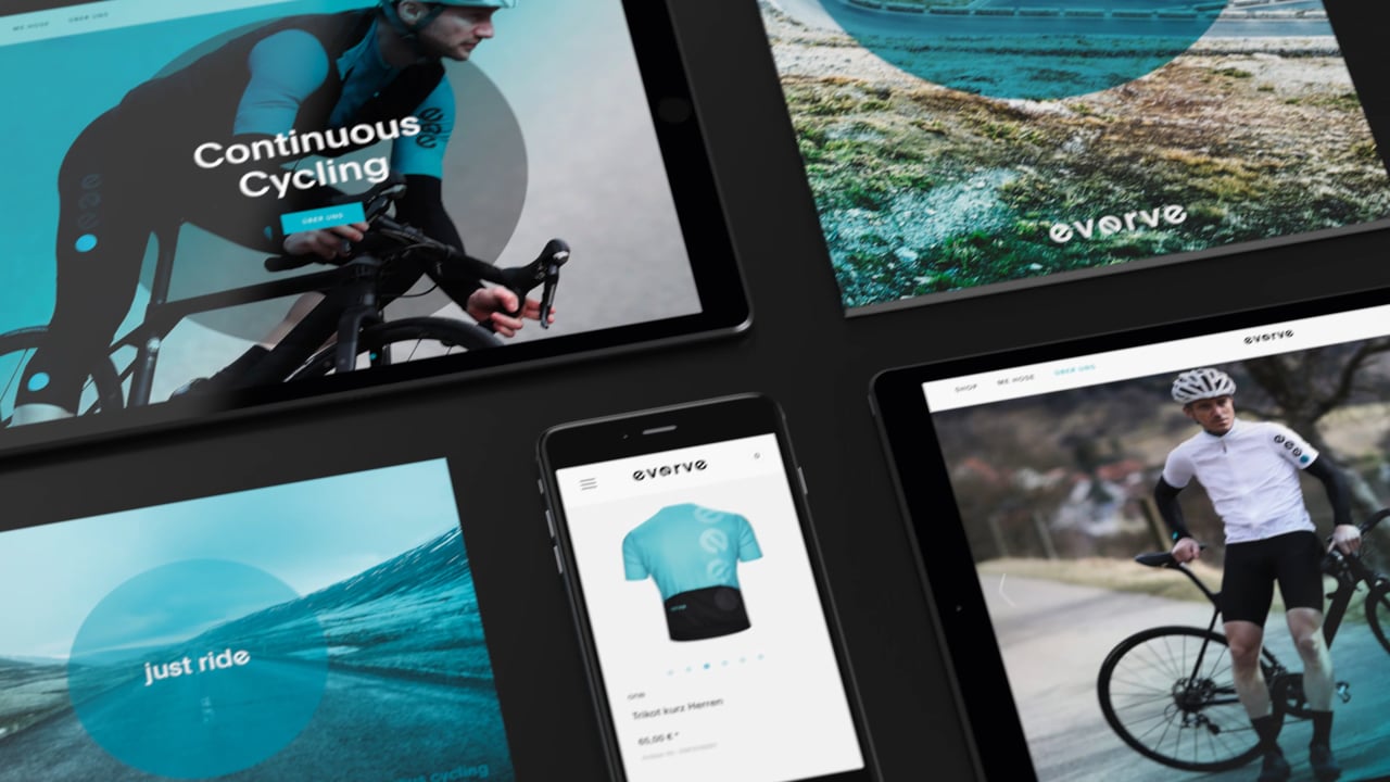
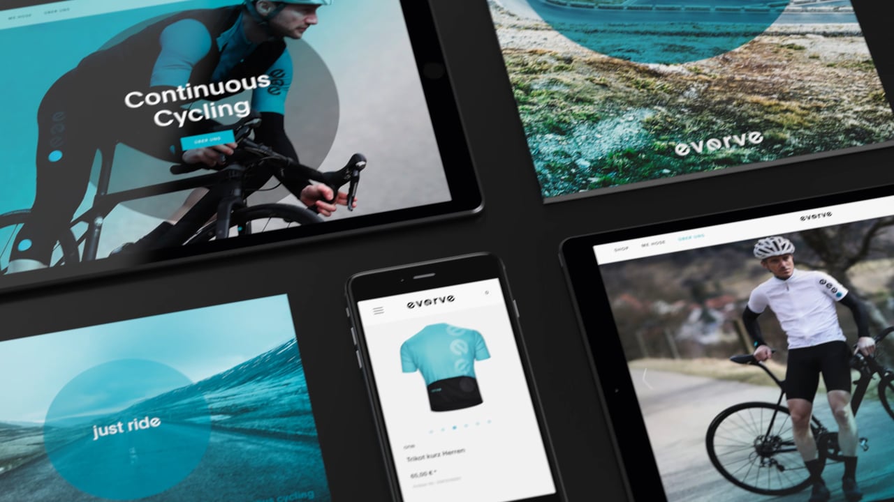
Everve products support the ideal that nothing distracts from cycling. Bike, itinerary and body are the only things that count. Mental and physical stammer are translated into the company’s guiding principle as a key for the whole brand identity: ‘continuous cycling’. As a central design element, the rotating letter e brings this idea to life and serves as a remarkable brand signal in all its products, media and packaging.
Everve – “Continuous Cycling”
Awards
Nomination
Graphic Design
Corporate Brand Identity
Member Club Gold Award
Graphic Design
Corporate Brand Identity
Details
Categories:
Country:
Year:
Credits
Client:
everve
Agency:
Account Executive:
Laura Kallenbach
Art Director:
Tara Otto
Dennis Melskotte
Marc Schäde
Majken Bagge
Chief Creative Officer:
Fabian Kirner
Creative Director:
Marc Schäde
Alexander Geh
Majken Bagge
Graphics:
Julien Mercier
François Rappo
Head of Planning:
José Luis Ramirez
Managing Director:
Michael Rewald
Managing Director Creation:
Rüdiger Goetz
Photographer:
Björn Hänssler
Oleg Kostyrev
Sound Designer:
Alexis Troy
More Corporate Brand Identity Works
-
Member Club Gold Award Graphic Design Corporate Brand Identity
-
Member Club Gold Award Graphic Design Corporate Brand Identity
Smor Premium Milk Butter
Loukas Chondros
-
Member Club Gold Award Graphic Design Corporate Brand Identity

Markedet
Skogen