
Fio da Navalha means razor’s edge and refers to taking risks, trying new things, mixing geographies, varieties and methods. It represents a new philosophy for a long-established brand, so it had to be met with a new approach. We art directed Lourenço Providência to illustrate the labels and the result is a contemporary approach to wine label design, distant from its most classical canons, with aery illustrations, handwritten lettering and an unusual use of colour.
Fio da Navalha
Awards
Bronze Award
Design
Packaging
Details
Categories:
Country:
Year:

Credits
Client:
Esporão
Agency:
Illustrator:
Lourenco Providencia

More Packaging Works
-
Silver Award Film & Audio Any OtherShortlist Design Packaging
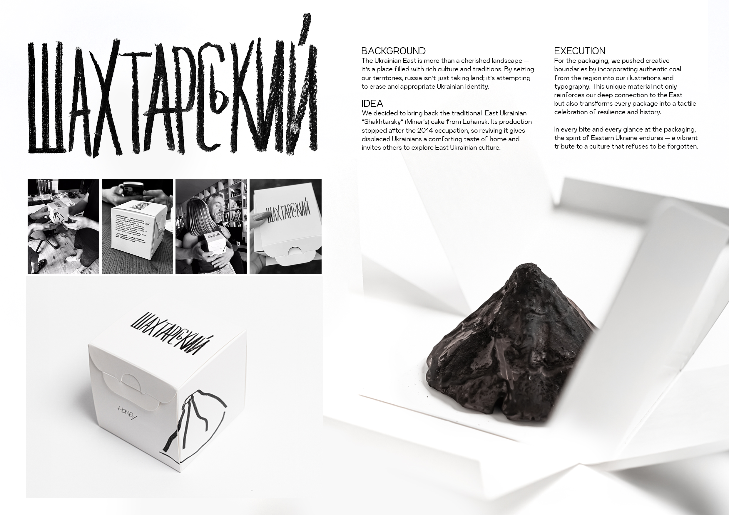
Reclaiming the East
Postmen / Kyiv
-
Shortlist Design Packaging
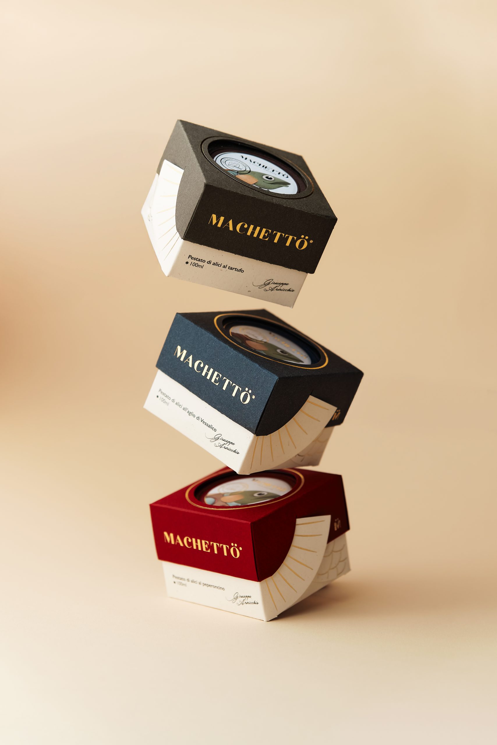
Machetto – tales of taste
Idea Studio © / Cava de'Tirreni
-
Shortlist Design Packaging

MANIN
PENSANDO EN BLANCO / HondarribiaMANIN Y SUS MUCHACHOS / EL BUSTO