
Kalevala Jewellery wanted to reimagine its brand as part of a major strategy renewal. The challenge was to revive and modernize Kalevala while at the same time strengthening the bond with its past. A part of this new identity called for a new typeface, which honours the original logo of Kalevala Koru from the 1930s. The typography provides one of the new brand’s most robust links to tradition.
Kalevala
Awards
Silver Award
Design
Typography
Details
Categories:
Country:
Year:

Credits
Client:
Kalevala
Agency:
Agency Producer:
Piia Suhonen
Juulia Järvi
Client's Representative:
Maria Uunila
Concept Designer:
Martin Mohr
Designer:
Toni Hurme
Jesper Bange
Teo Georgiev
Graphics:
Juhku Pekkala
Simo Heikkinen
Strategist:
Nils Kajander
Type Designer:
Teo Tuominen



More Typography Works
-
Bronze Award Design TypographyShortlist Design Corporate Brand Identity
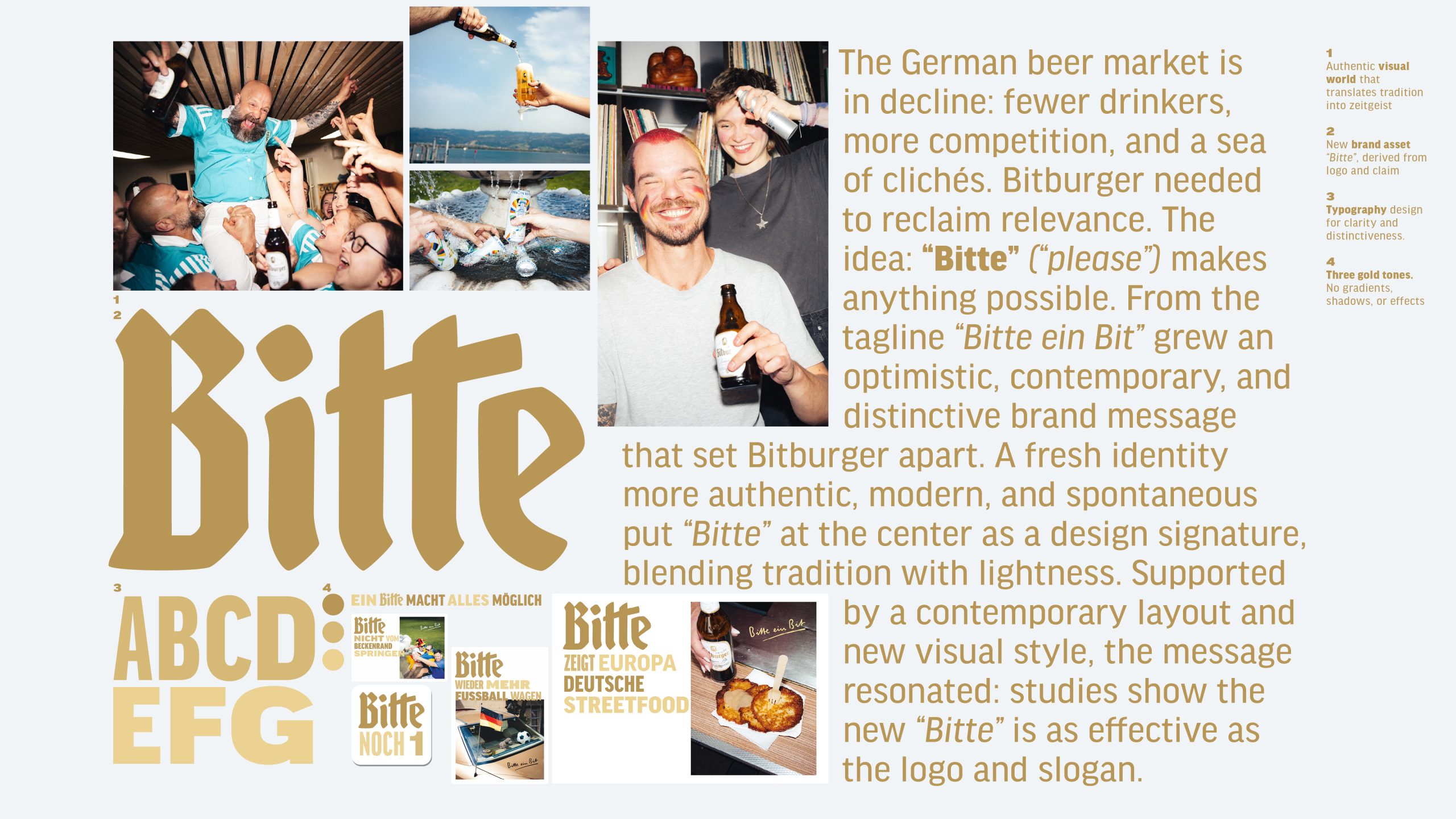
Bitburger Redesign – A ‘Bitte’ makes everything possible
SERVICEPLAN GERMANY / Munich
-
Silver Award Design Typography

M1 Radio – Custom Alphabet for a Cultural Icon
ANDSTUDIO / Vilnius
-
Silver Award Design Typography
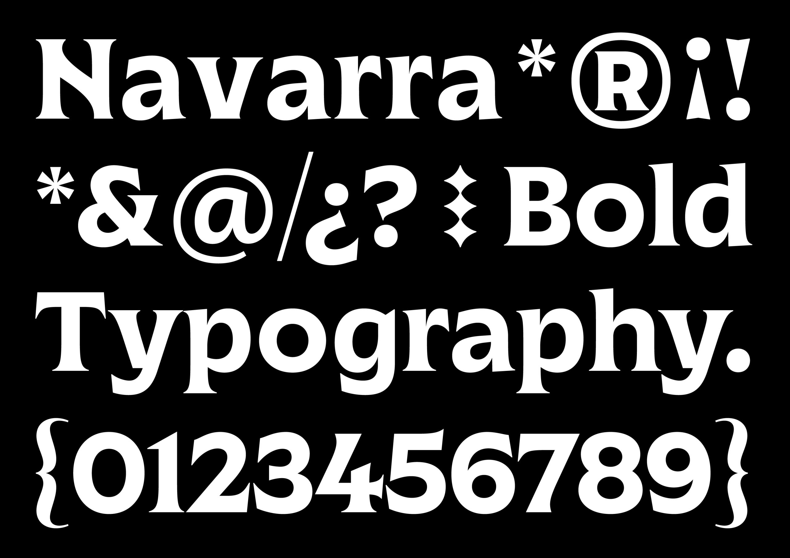
Marca Navarra
Prodigioso Volcán / Madrid