
Kindluse Kool is a municipal school for kids aged 7 to 16. A font called “the alphabet” was created for the school’s core visual identity. The font is based on geometric shapes, including a grid and linear notebooks. The alphabet provided inspiration for all the environmental graphics: walls, carpets, and signage. The school’s different levels are set apart by different colours. The overall impression is clear, bright and cheerful.
Kindluse School
Awards
Bronze Award
Design
Spatial Design
Member Club Gold Award
Design
Spatial Design
Details
Categories:
Country:
Year:

Credits
Client:
Kindluse Kool
Agency:
Agency Producer:
Annika Avikson
Art Director:
Kärt Villmann
Eliise Raadik
Creative Director:
Kärt Villmann


More Spatial Design Works
-
Shortlist Design Spatial Design
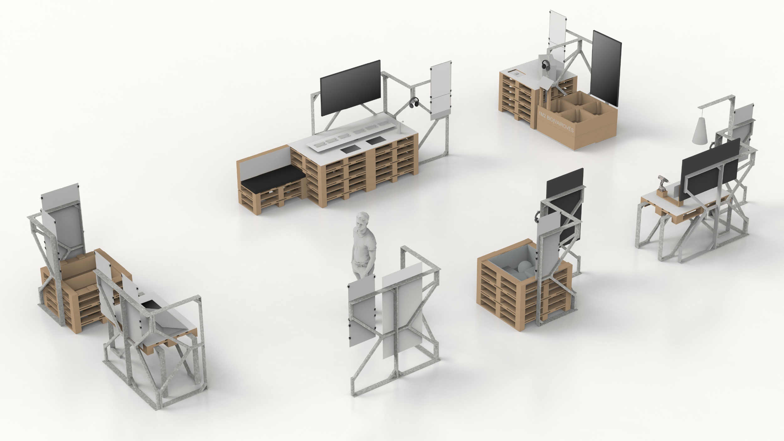
CREATORS OF SUSTAINABLE VILNIUS
The Critical / Vilnius
-
Shortlist Design Spatial Design

Made of Goals – The Golden Generation Monument
Rusu+Bortun Bucharest / BucureștiMonument For – Monument Administration / BucureștiDBO / București
-
Silver Award Print & Outdoor Special OutdoorShortlist Design Spatial Design
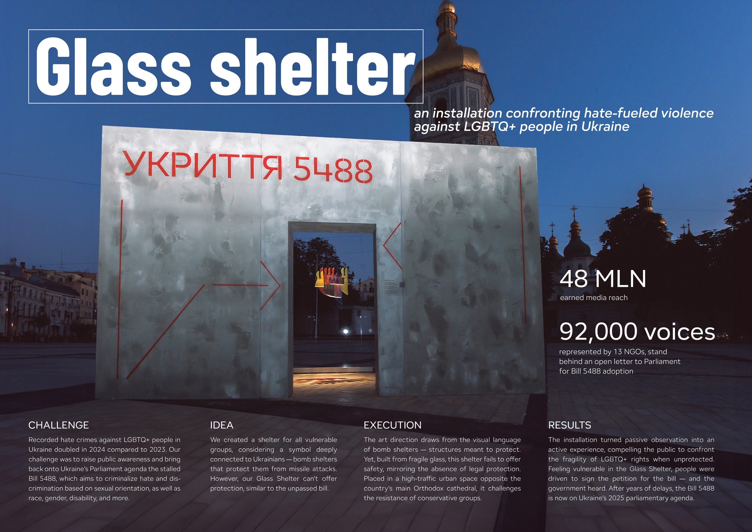
Glass Shelter
ISD Group / KyivHow Production / KyivRizni.Rivni / Kyiv