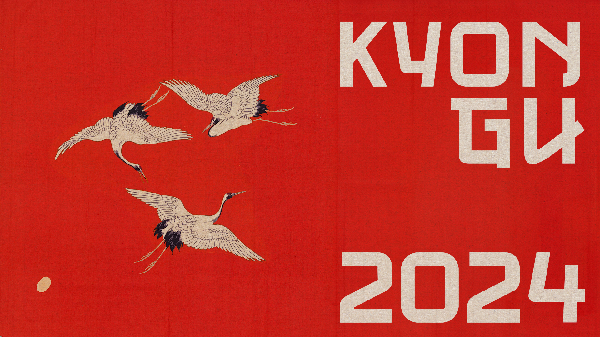
Kyongu Display is an experimental typeface created as part of a project that looks into typographic design from research to technical development. The project uses Glyphs software to bring to life a display typeface, inspired by cultural elements. In this case, the design concept is based on the aesthetics and structure of the Japanese alphabet.
The Kyongu typeface takes as a reference the geometry and visual balance of Japanese characters: kanji, hiragana and katakana. These writing systems share a common characteristic: their characters are designed within a square space, and have no distinction between upper and lower case. This principle is key in Kyongu Display, as it is presented as a Unicase typeface, maintaining a harmonious visual consistency.
The combination of balanced proportions and stylized curves reflects the influence of Japanese calligraphy, reinterpreting its essence in a modern and minimalist way. Being a display typeface, Kyongu is designed to stand out in titles and large formats, where its geometric and elegant characteristics can be appreciated in detail.rnThis project not only explores Japanese cultural aesthetics, but also the technical and conceptual challenges of type design, demonstrating a comprehensive approach that unites research, technique and creativity.