
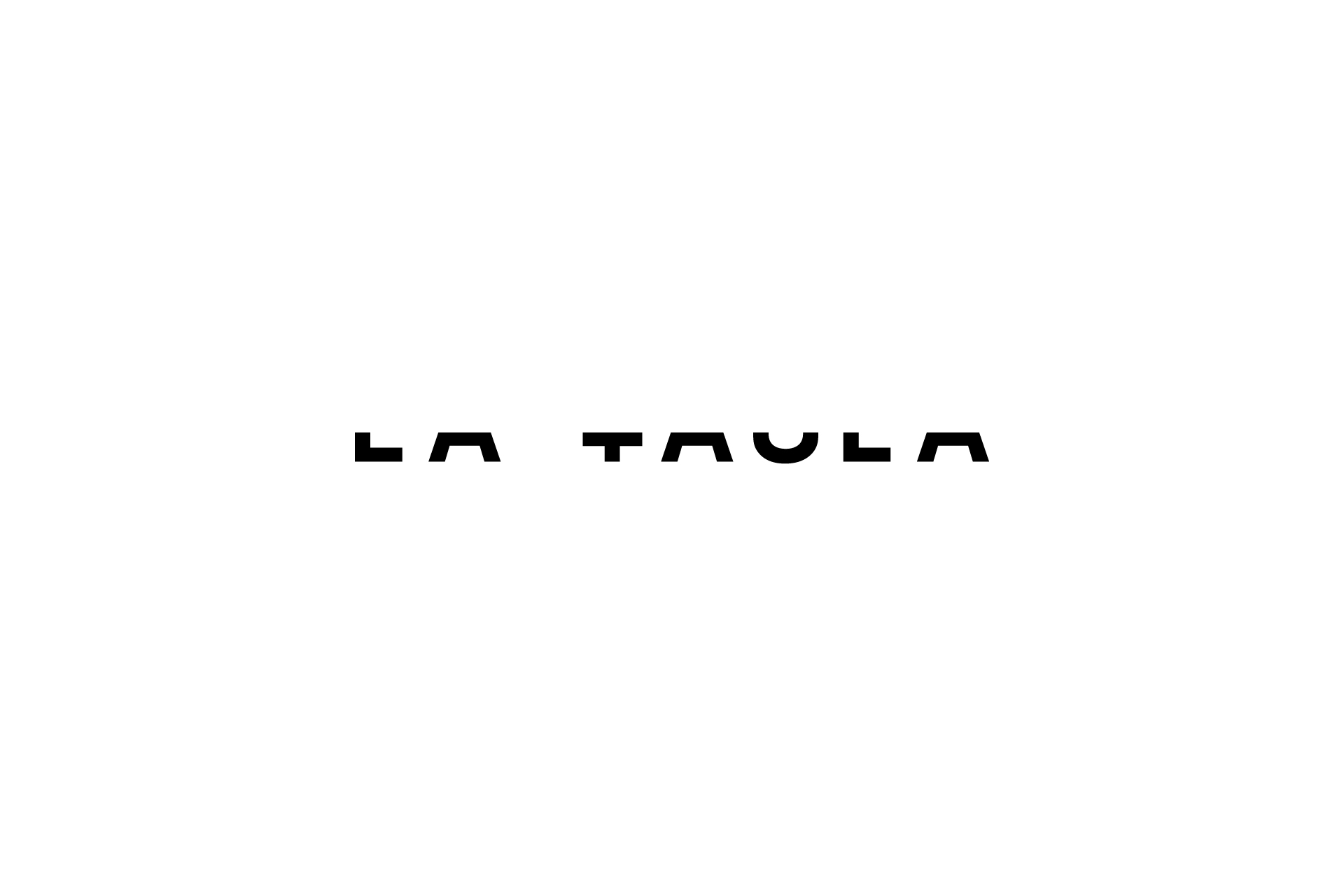
“La Taula” is a social project. “Taula” means table, and arround a table we help students who have just finished their degree in graphic design to give them additional training.rnHelvetica (1957) is the referent type for designers. Its “mother” is Akzidenz Grotesk (1896). A horizontal cut converts Akzidenz into the visual semantics of a table.rnThe experimental typographic exercise shows how to create a current and unique graphic design based on a traditional object.
LA TAULA
Awards
Silver Award
Design
Logotype
Details
Categories:
Country:
Year:
Credits
Client:
LA TAULA
Agency:
Designer:
Hazael Rico


More Logotype Works
-
Shortlist Design Logotype
20 Years of Casa da Música
Bastarda / Porto
-
Bronze Award Design Logotype
100
A EQUIPA / LisbonThe Other Studio / Lisbon
-
Silver Award Design Logotype

M1 Radio – Reviving the Golden-Age Logo for Today
ANDSTUDIO / Vilnius