
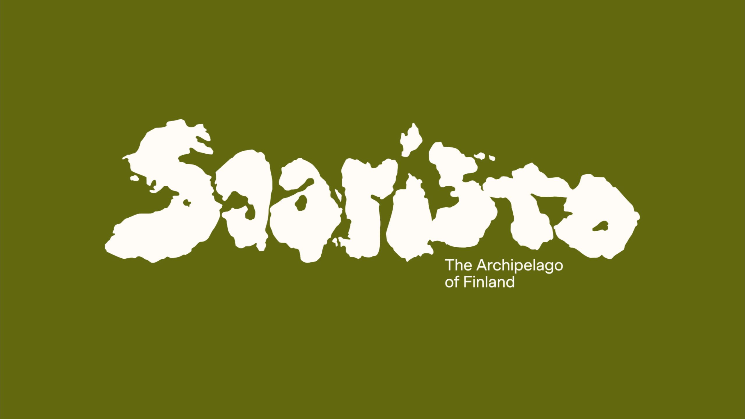
The brand identity for Saaristo, a globally attractive new destination brand, is taking authenticity and cultural value in branding to a new level. To introduce Saaristo as it is – a life-shaping experience of vast space, unique stillness, raw nature, and sincere culture – we kept its birth name and let the islands shape its identity. After 20 hours well-spent in Google Maps, there was a handpicked island shape for each letter found among the 40.000 islands.
Saaristo – Logo
Awards
Gold Award
Design
Logotype
Details
Categories:
Country:
Year:
Credits
Client:
Visit Turku Archipelago
Agency:
Creative Director:
Liisa Paasio


More Logotype Works
-
Shortlist Design Logotype
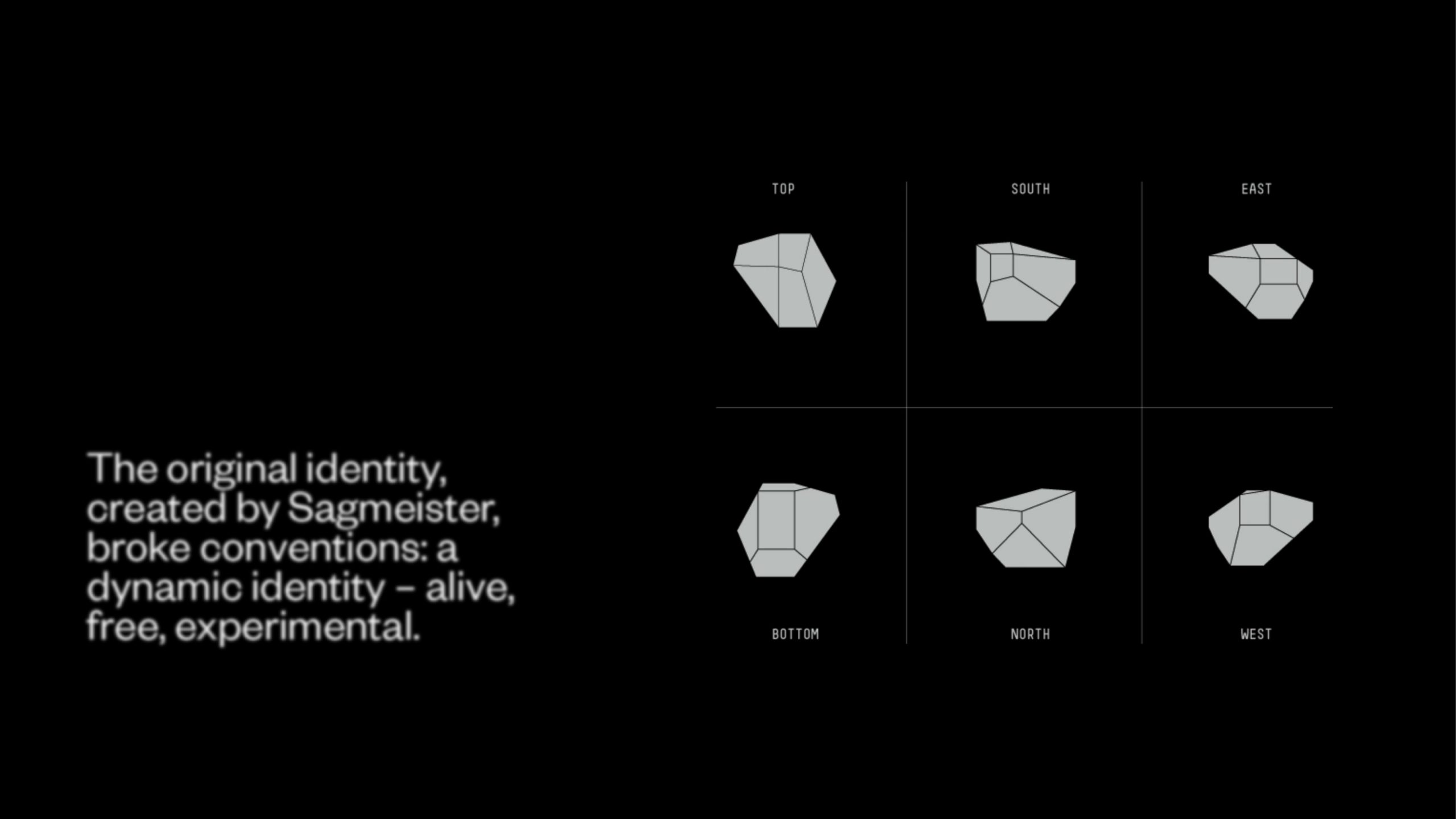
20 Years of Casa da Música
Bastarda / Porto
-
Bronze Award Design Logotype
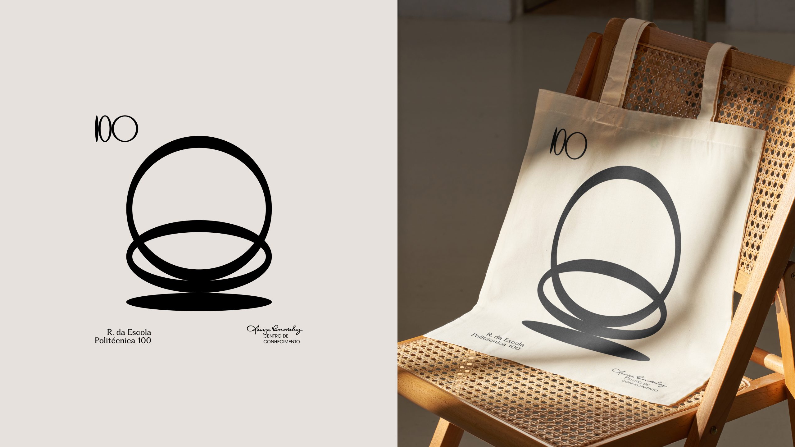
100
A EQUIPA / LisbonThe Other Studio / Lisbon
-
Silver Award Design Logotype

M1 Radio – Reviving the Golden-Age Logo for Today
ANDSTUDIO / Vilnius