
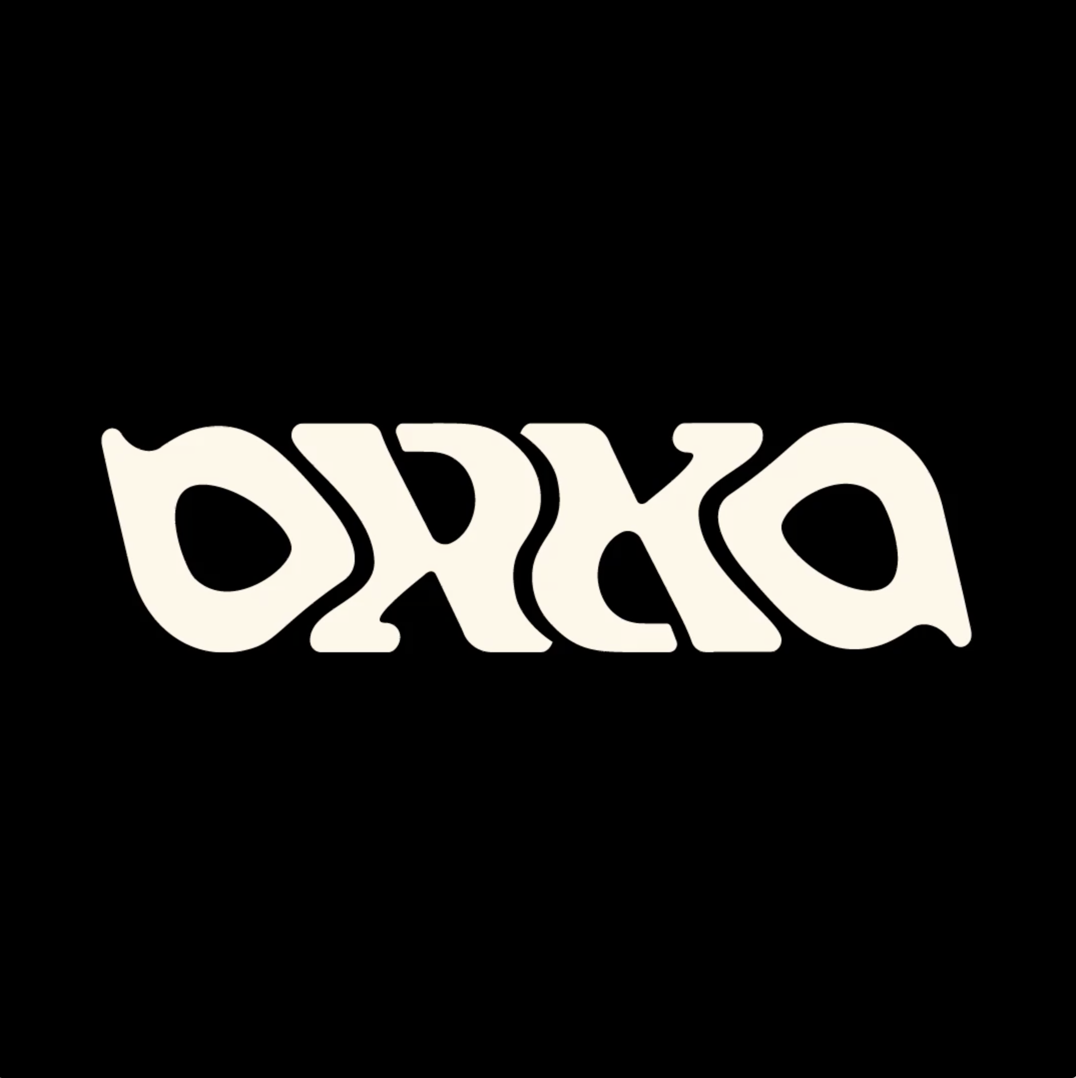
Orka’s logo, inspired by Icelandic heritage lettering, blends traditional craftsmanship with modern fluidity. It’s an ambigram designed to be readable from any angle—whether it’s upside down or inside out– symbolizing the brand’s flexibility. The design reflects Orka’s shift from a macho energy drink to a creative platform, showing that no matter how you look at it, Orka is all about embracing new perspectives and moving at the speed of culture.
New Gen Energy
Awards
Shortlist
Design
Logotype
Details
Categories:
Country:
Year:
Credits
Client:
Olgerdin
Agency:
Creative Director:
Arnar Halldorsson
Hrafn Gunnarsson


More Logotype Works
-
Shortlist Design Logotype
20 Years of Casa da Música
Bastarda / Porto
-
Bronze Award Design Logotype
100
A EQUIPA / LisbonThe Other Studio / Lisbon
-
Silver Award Design Logotype

M1 Radio – Reviving the Golden-Age Logo for Today
ANDSTUDIO / Vilnius