
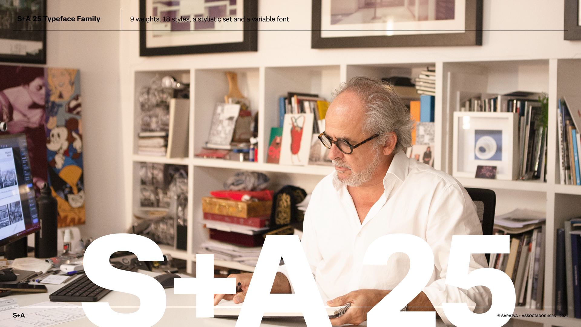
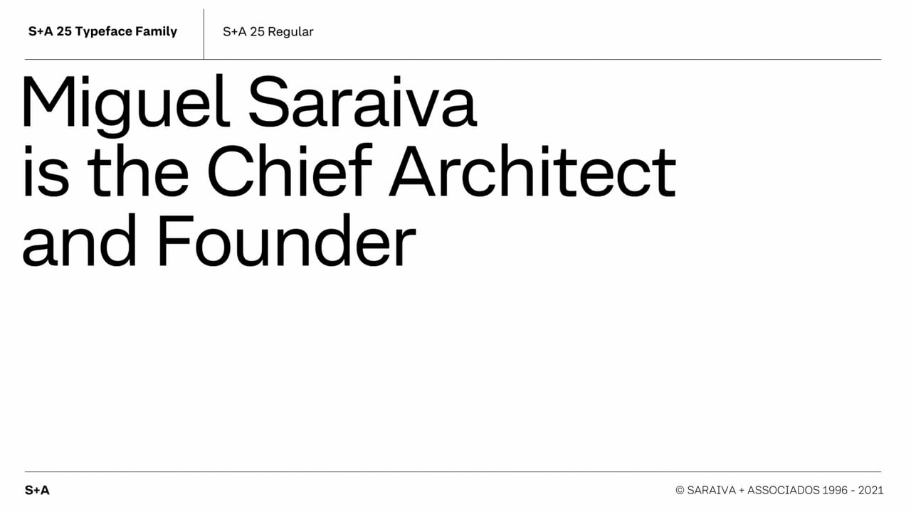
S+A 25 is subtly inspired by the handwriting of Miguel Saraiva, the chief architect and founder of S+A. In a restrained but incisive way, it links his character to the visual and written expression of the company in all contexts. S+A 25 is distributed and used by its offices worldwide, unifying the company and strengthening the brand. S+A 25 is a bespoke corporate typeface family with 9 weights and 18 styles, a variable font, and 1 stylistic set.
S+A 25
Awards
Bronze Award
Design
Typography
Details
Categories:
Country:
Year:
Credits
Client:
Saraiva+Associados
Agency:
Art Director:
Luís Bandovas
Copywriter:
Deadinbeirute
Creative Director:
Deadinbeirute
Designer:
Luís Bandovas
Deadinbeirute


More Typography Works
-
Bronze Award Design TypographyShortlist Design Corporate Brand Identity
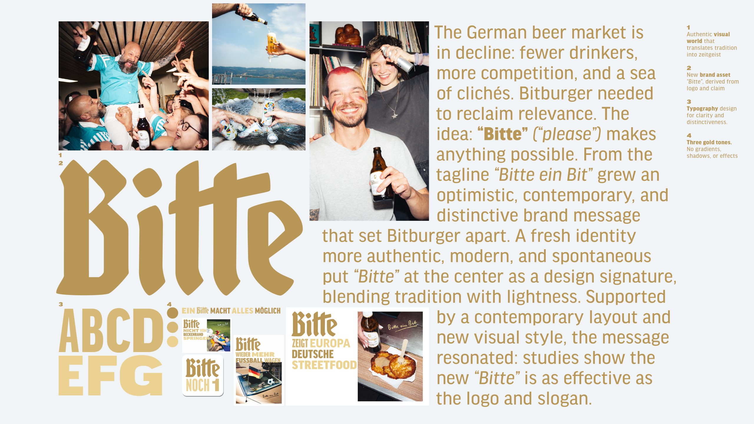
Bitburger Redesign – A ‘Bitte’ makes everything possible
SERVICEPLAN GERMANY / Munich
-
Silver Award Design Typography

M1 Radio – Custom Alphabet for a Cultural Icon
ANDSTUDIO / Vilnius
-
Silver Award Design Typography
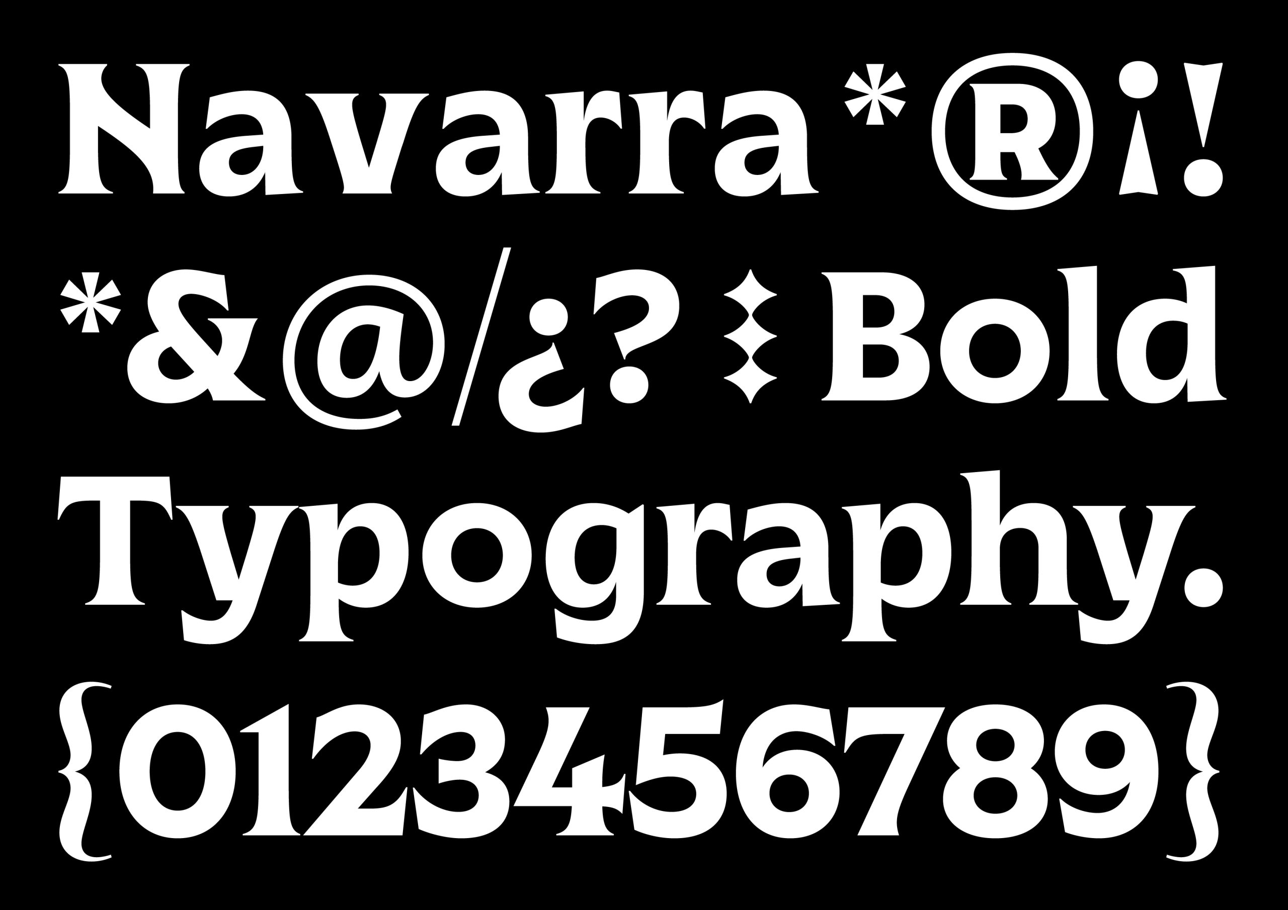
Marca Navarra
Prodigioso Volcán / Madrid