
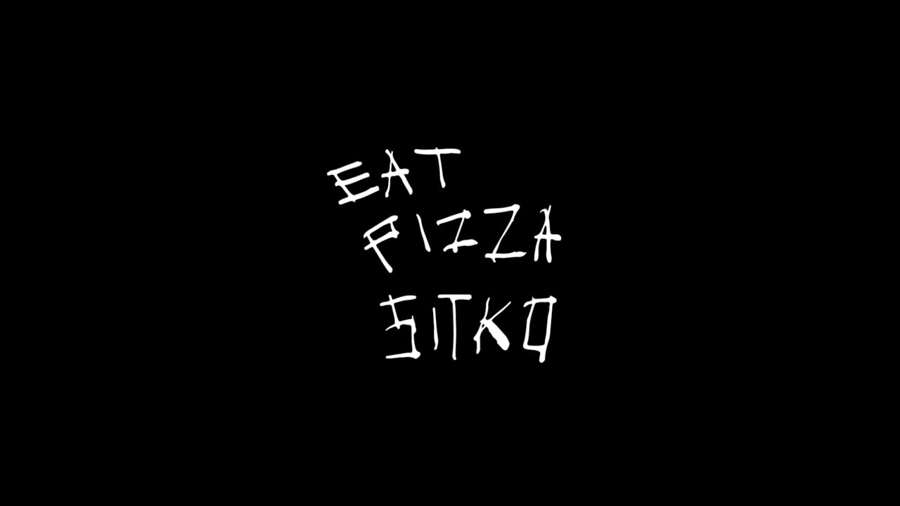
Our brief was simply “to sprinkle on some punk rock to spice it up”. A dough ball is Sitko’s heart and soul, a living ecosystem of life forms, organic and constantly transforming. A perfect symbol for a sourdough pizza company. We reduced it to an extremely simplistic and recognizable emblem – an irregular rounded shape. Combined with collagesque, black-and-white aesthetics, and raw, handmade style, the visual style is a tribute to the DIY subcultures.
Sitko Pizza
Awards
Gold Award
Design
Corporate Brand Identity
Gold Award
Design
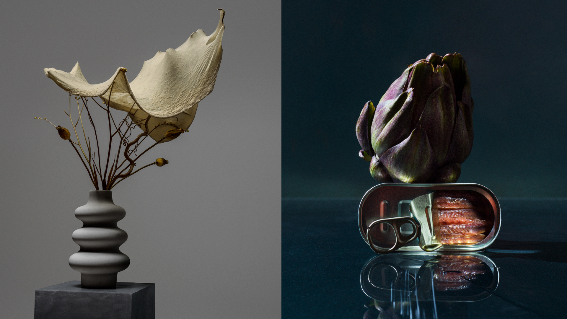
Photography
Details
Categories:
Country:
Year:
Credits
Client:
Sitko Pizza
Agency:
Art Director:
Mikko Reponen
Copywriter:
Henry Taavitsainen
Designer:
Juuso Siltanen
Motion Designer:
Timo Bontenbal
Other:
Isabella Ekström
Photographer:
Tuukka Koski
Programmer:
Richard Grosjean
Thierry François
Project Manager Photography:
Pekka Ala-Seppälä
Strategist:
Janne Kaitala


More Corporate Brand Identity Works
-
Shortlist Design PhotographyShortlist Print & Outdoor Craft – Photography
Forever Golf
Fuego Camina Conmigo / Barcelona
-
Shortlist Design Corporate Brand IdentityShortlist Design Packaging
ABASOTAS FOOD STUDIO
PENSANDO EN BLANCO / HondarribiaABASOTAS FOOD STUDIO / BARRIKA
-
Shortlist Design Corporate Brand Identity
Saaristo Brand Identity
BOND Creative Agency / helsinkiVIsit Turku Archipelago / Turku