
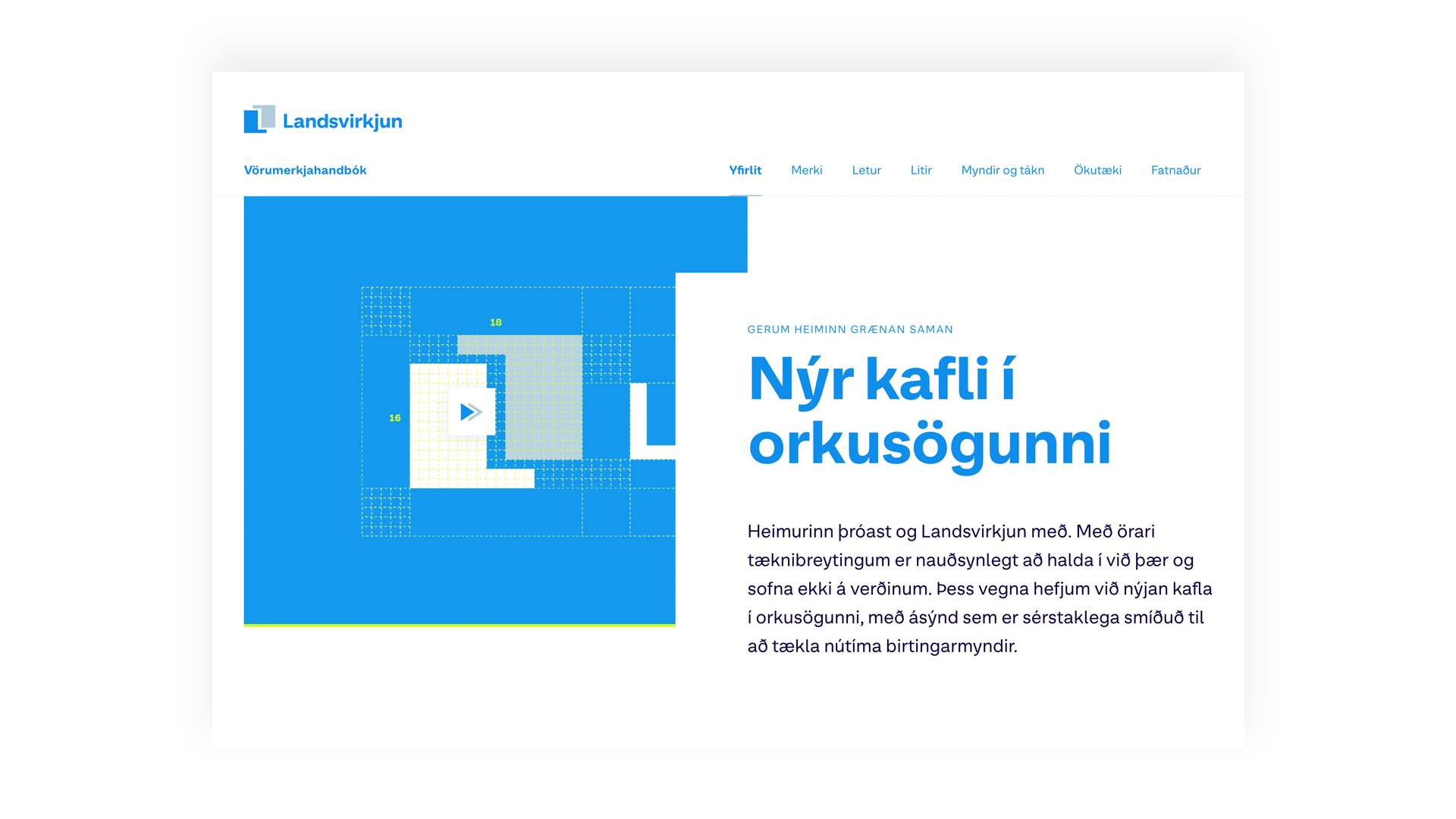
The history of Landsvirkjun’s logo, made by Ágústa P. Snæland, spans 5 decades. This new iteration is brought closer to the Snæland’s original ideas and made to adapt the brand to modern media usage. The new logo features Landsvirkjun’s new typeface, LV Sans, designed specifically for Landsvirkjun based on it’s characteristics. The brand colours were carefully selected to work well with both digital and printed media alike.
Vörumerkjahandbók Landsvirkjunar
Awards
Member Club Gold Award
Interactive & Mobile
Interactive Design
Details
Categories:
Country:
Year:
Credits
Client:
Landsvirkjun, National Power Company of Iceland
Agency:
Creative Director:
Atli Þór Árnason
Hörður Lárusson
Designer:
Simon Viðarsson
Helena Rut Sveinsdóttir
Anton Jónas Illugason
Programmer:
Samúel Þór Smárason
Margrét Finnbogadóttir


More Interactive Design Works
-
Shortlist Interactive & Mobile Interactive Design
CO2
Kolibri / Reykjavík
-
Shortlist Interactive & Mobile Interactive Design
Global Design Studio
SILENCIO / Pamplona
-
Bronze Award Interactive & Mobile Interactive Design
Elders Project
Huncwot / Warsaw