
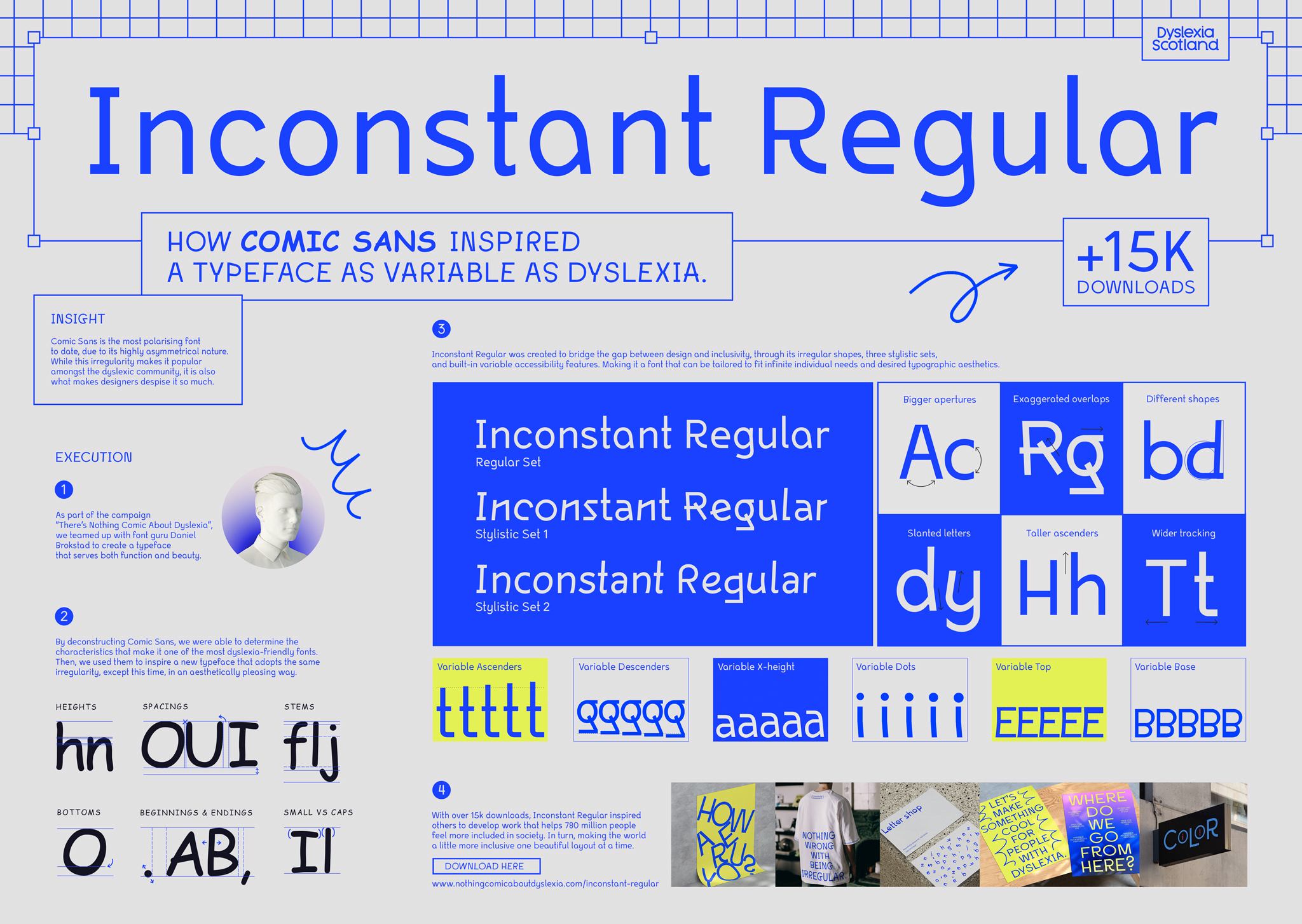
By using Comic Sans as the hero of our direct campaign, we were guaranteed to grab the attention of the people who can influence change when it comes to design inclusivity. The campaign uses the most hated font by the design world, which also happens to be the most favoured font by dyslexic people, to challenge designers to bridge the gap between aesthetics and function. And that is by creating fonts that are both dyslexia-friendly and beautiful at the same time.
There’s Nothing Comic About Dyslexia
Awards
Gold Award
Design
Typography
Gold Award
Integrated & Innovation
Integrated and Innovation for non-profit / public service / NGO
Silver Award
Print & Outdoor
Direct Marketing
Silver Award
Print & Outdoor
Print & Outdoor for non-profit / public service / NGO
Bronze Award
Design
Graphic Communication
Details
Categories:
Country:
Year:
Credits
Client:
Dyslexia Scotland
Agency:
Designer:
Elise Chastel
Paula Santos


More Direct Marketing Works
-
Shortlist Print & Outdoor Print & Outdoor for non-profit / public service / NGO
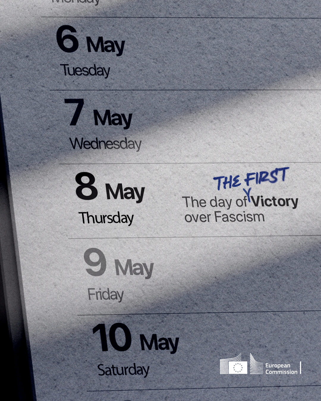
CALENDAR UPDATE
THIS IS LOCCO
-
Shortlist Print & Outdoor Print & Outdoor for non-profit / public service / NGOShortlist Print & Outdoor Craft – PhotographyShortlist Print & Outdoor Craft – Art Direction
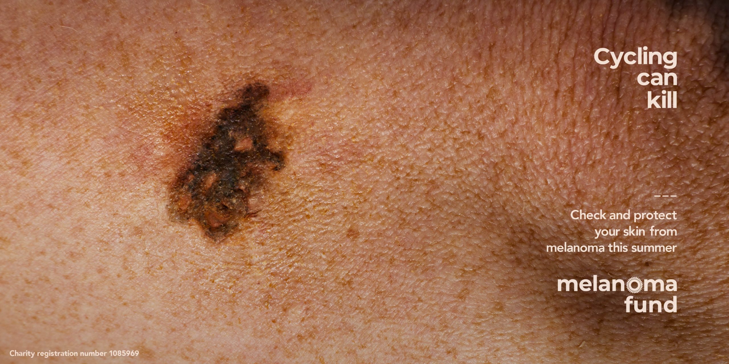
Silhouettes
neverland / LondonJames Day / London
-
Shortlist Print & Outdoor Print & Outdoor for non-profit / public service / NGOShortlist Print & Outdoor Craft – Art Direction
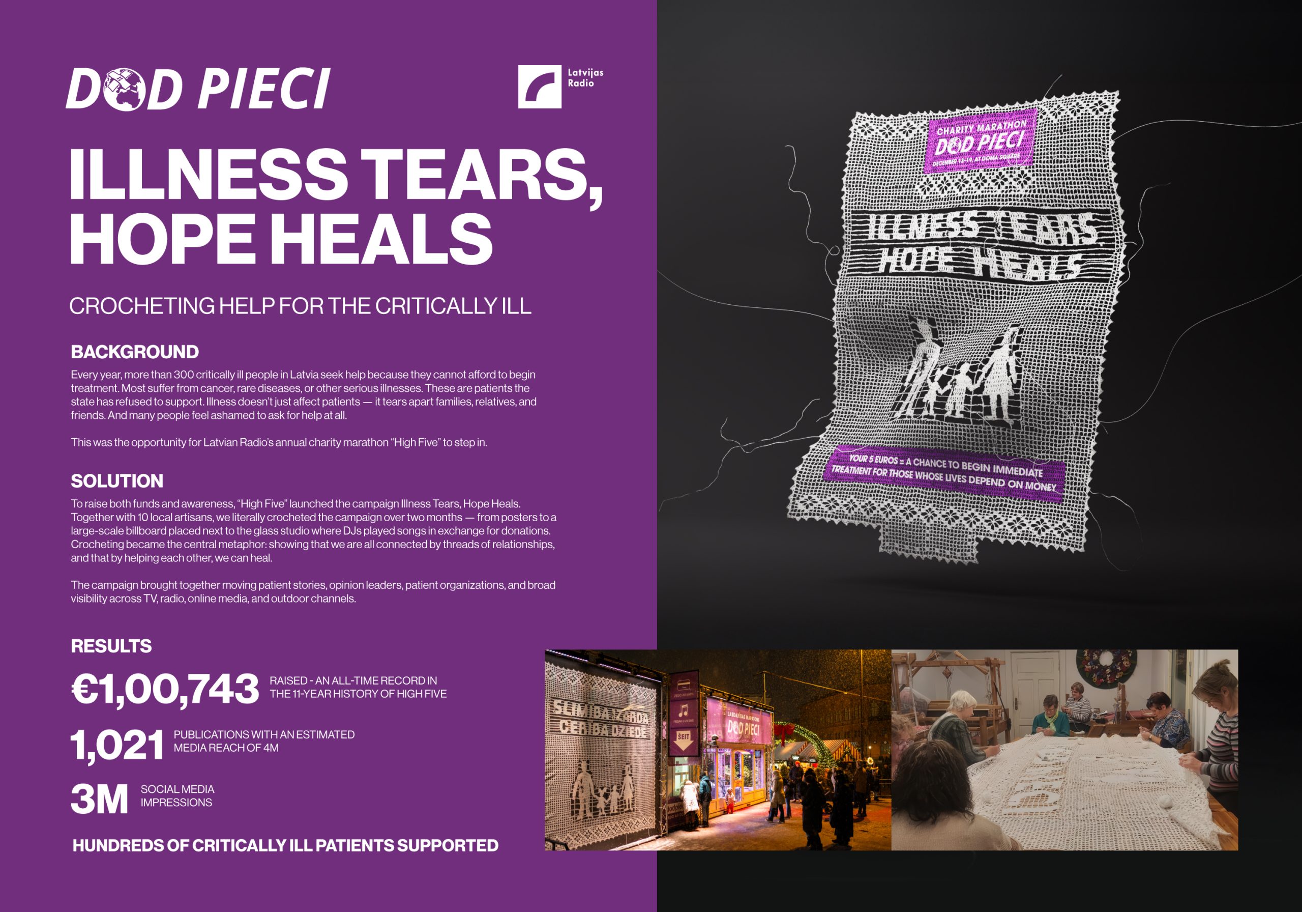
Illness Tears, Hope heals
MAGIC Agency