A brand that aims to offer new ecological perspectives by presenting its products with a strong connection to design and visual arts. Inspired by the modern pop culture of East Asia, it forms a connection with a young and creative audience, always with the energy to improve and grow. The brand seeks to be a pioneering commercial alternative when offering its products, aiming to solve problems in a simple, fresh, and creative way.
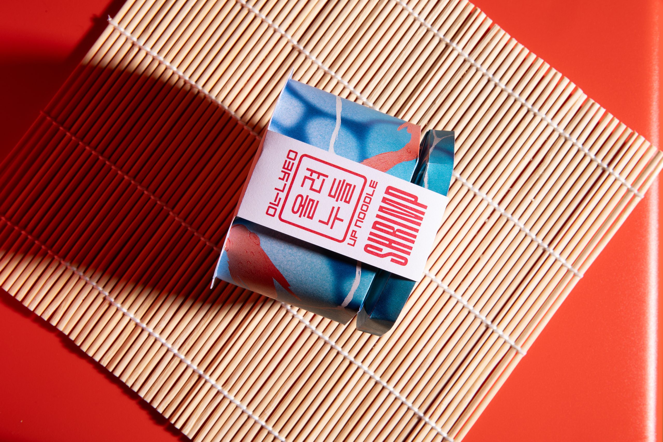
This eco-friendly packaging aims to reduce CO2, facilitate stacking for better transport and storage, maintain its original usability (with the ability to add water), and the ‘grab & go’ concept, implementing the Kresling origami mechanism.
The Kore typography is inspired by Korean writing (Hangul), referencing its geometry. The logo resembles the dojang (a traditional stone or wooden stamp used to sign your name in Hangul) and the visual signage of the city of Seoul.